Wayfinding Signages for Bus Interchanges/Terminals
Pasir Ris ITH
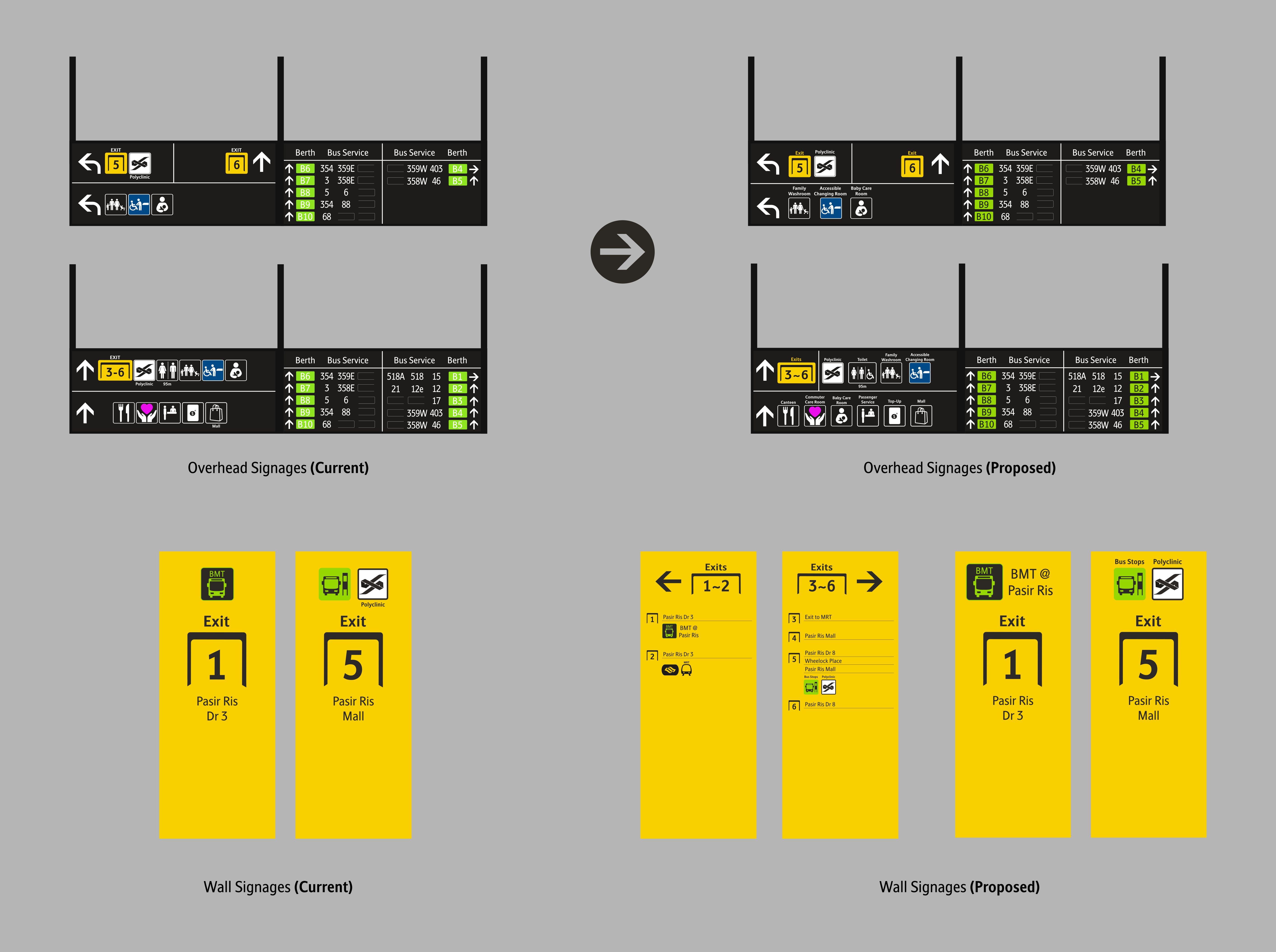
Overhead/Wall Signages
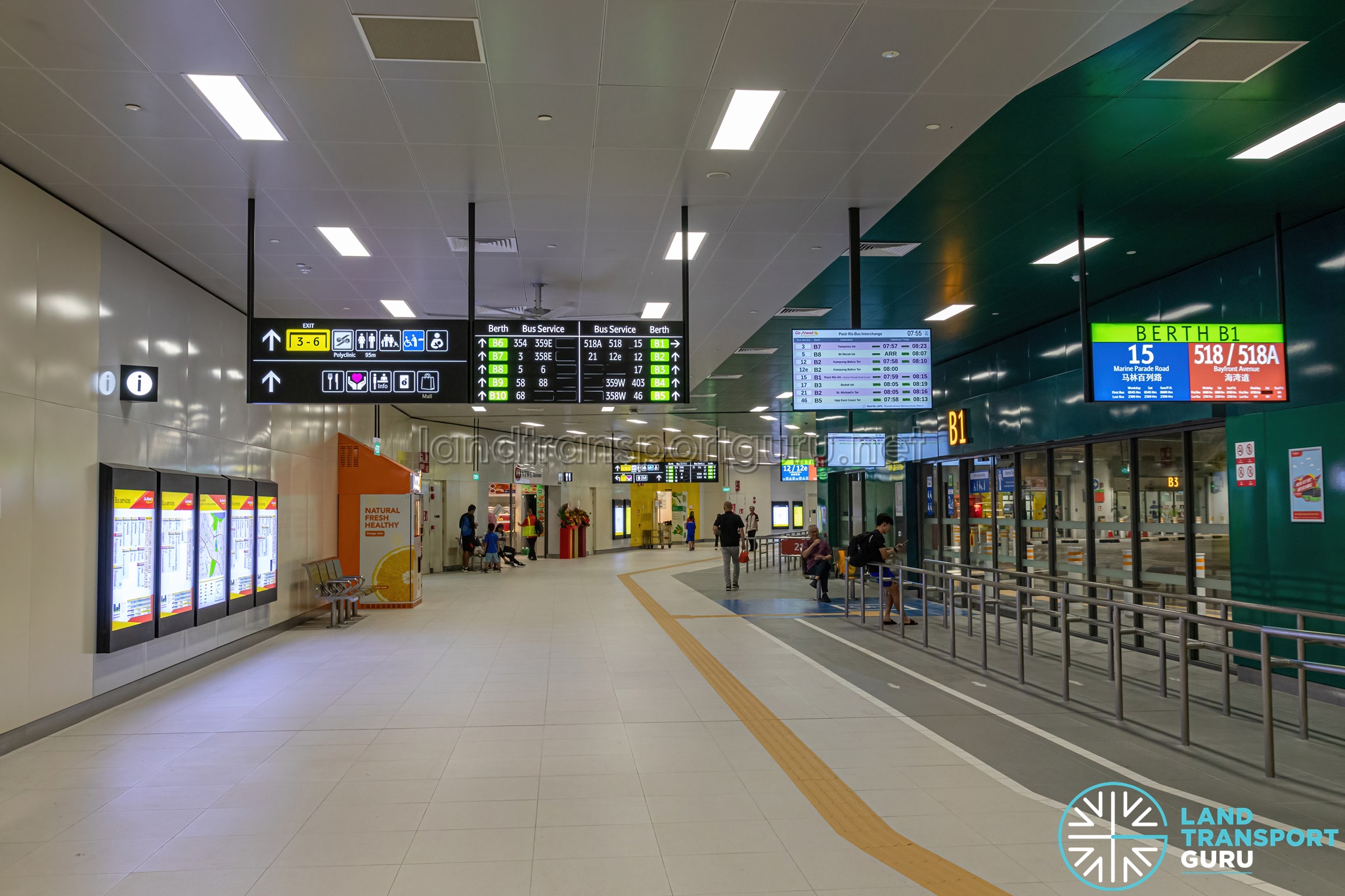
Let's take the newly opened Integrated Transport Hub (ITH) at Pasir Ris as an example. While it has already adopted the current wayfnding systems, the implementation, in my opinion, leaves much to be desired.
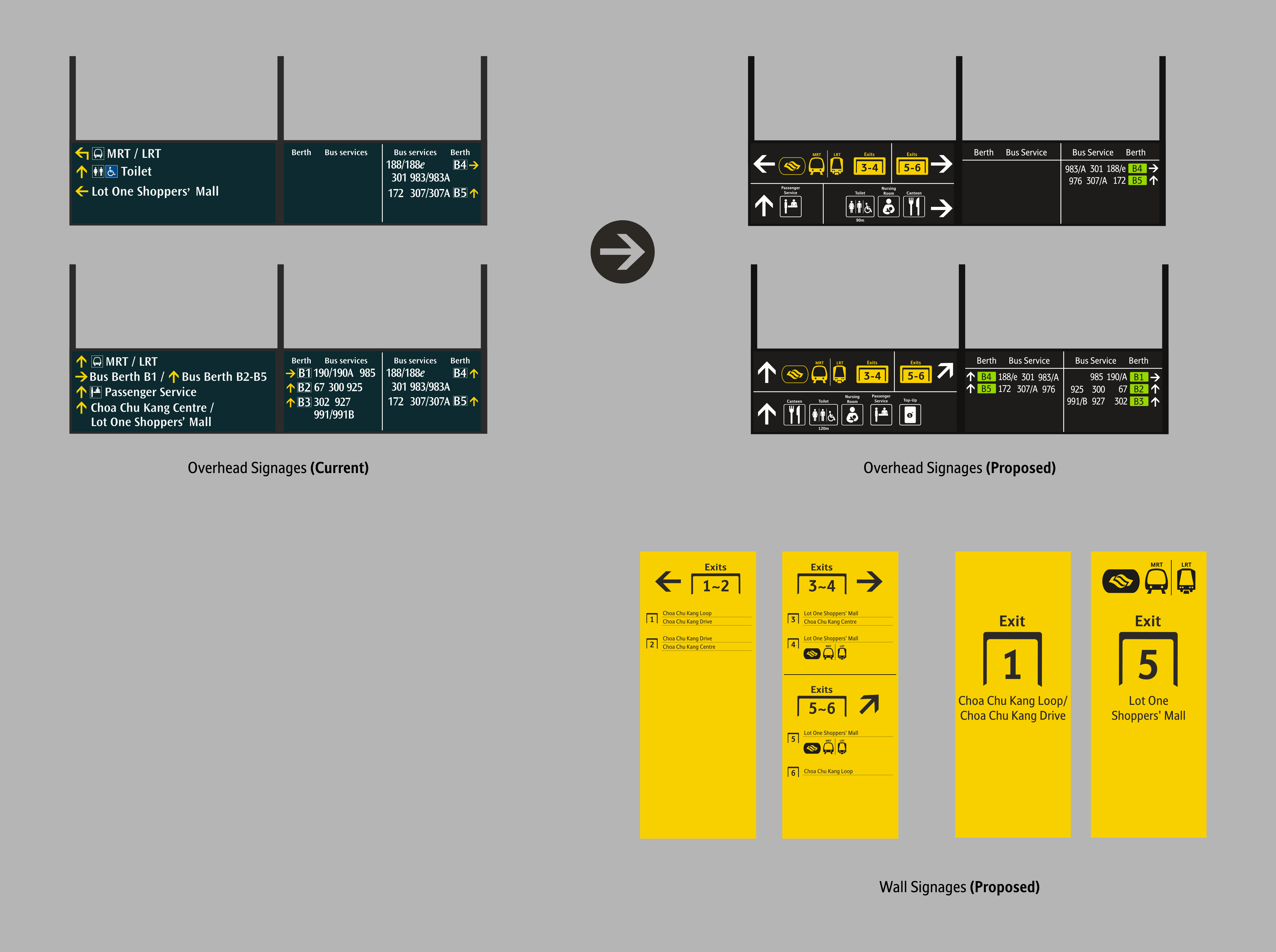
Firstly, for the Wayfinding Icons, I find them too cluttered as everything has been lumped together.
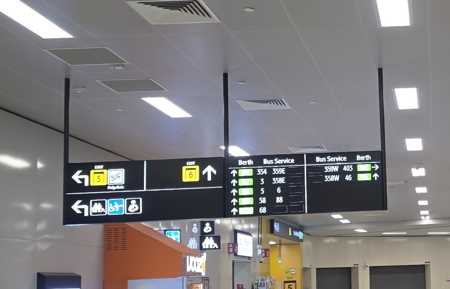
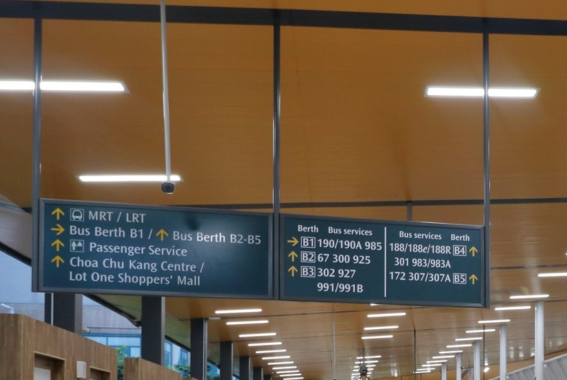
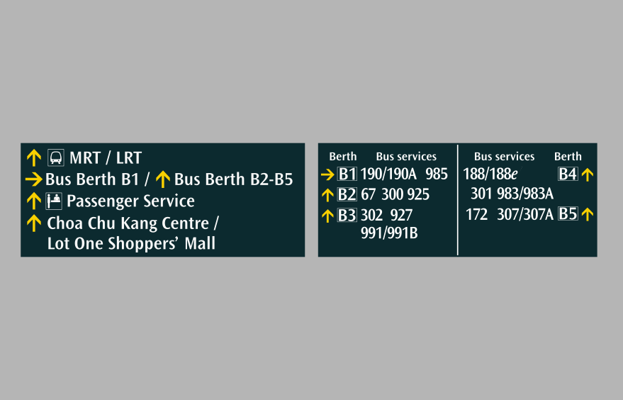
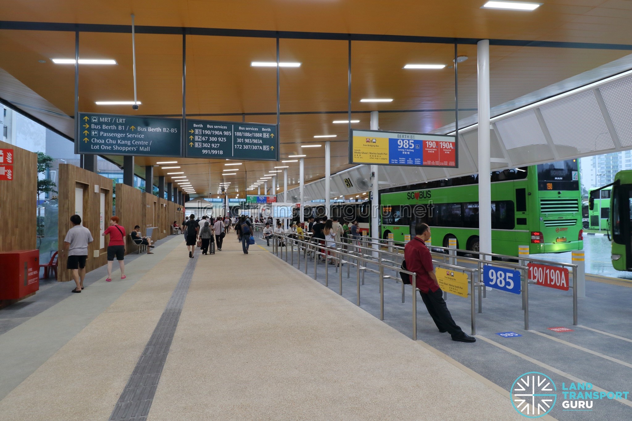
Current Implementation
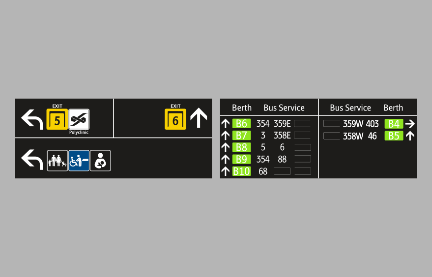
Current Implementation - Recreated
📸: Land Transport Guru
So I've decided, why not decouple the Exit signage from the other signages? Labels are also added for enhanced clarity.
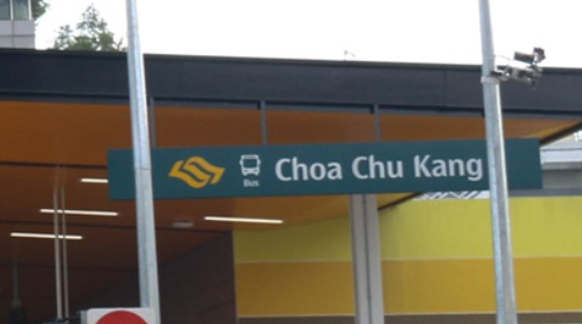
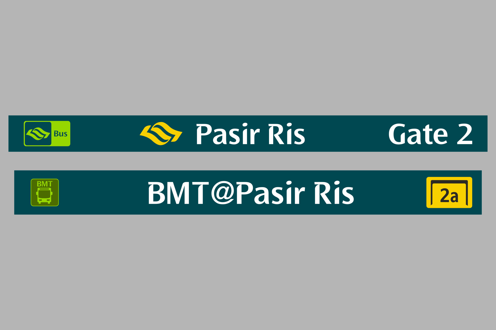
Interchange Name Signages
Let's take a look at the Interchange Name signages implemented at the Pasir Ris ITH.
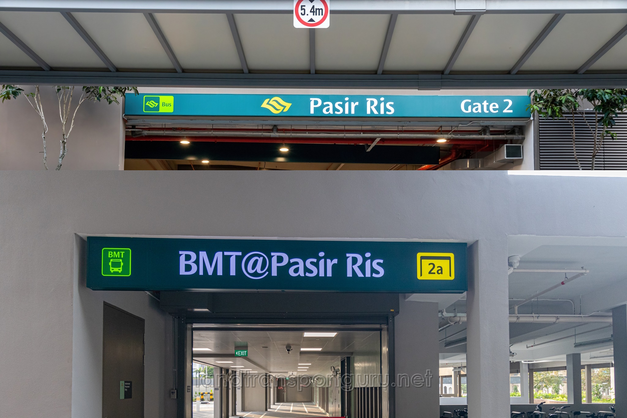
Current Implementation
📸: Land Transport Guru
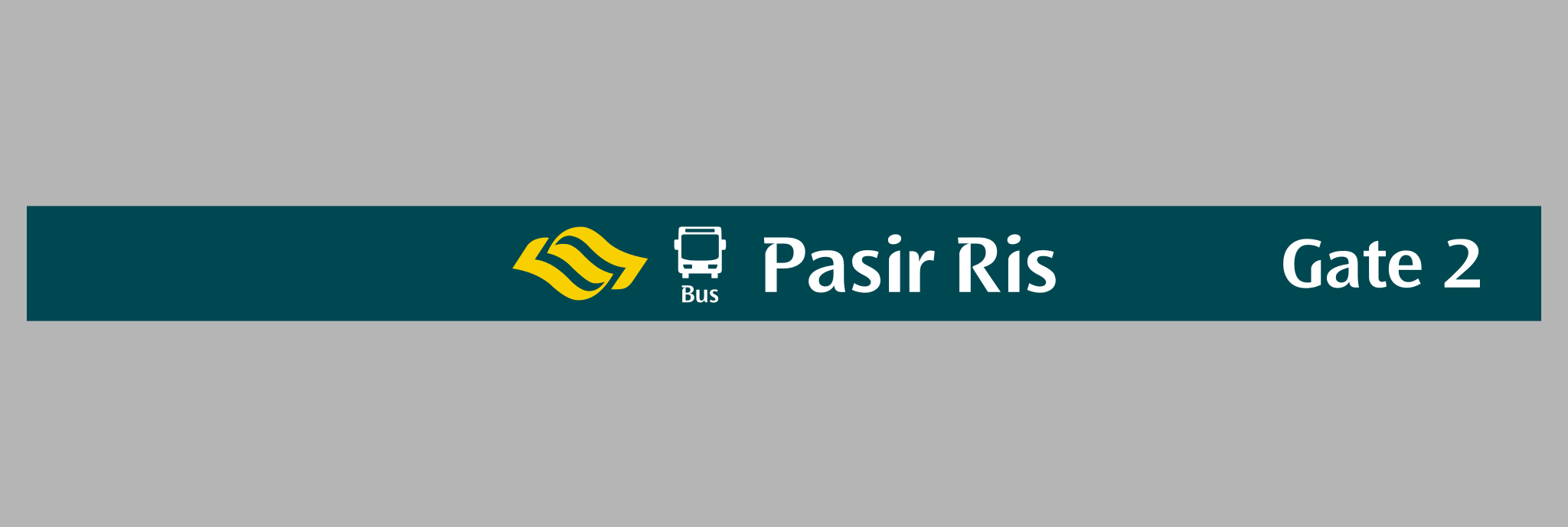
Current Implementation - Recreated
The design implemented here is very inconsistent and weird. The caplets were weirdly scaled, and the weird duplication of caplets (the yellow SG icon itself were used on the previous Design System, and the new Bus Icon were used on the new Design System) makes it look awkward.
Interchange Name signage with the old design system
Hence I've decided to redesign and make the design more consistent. As mentioned in the second page, I have decided to only stick with just the Dark Grey colour across all signages.
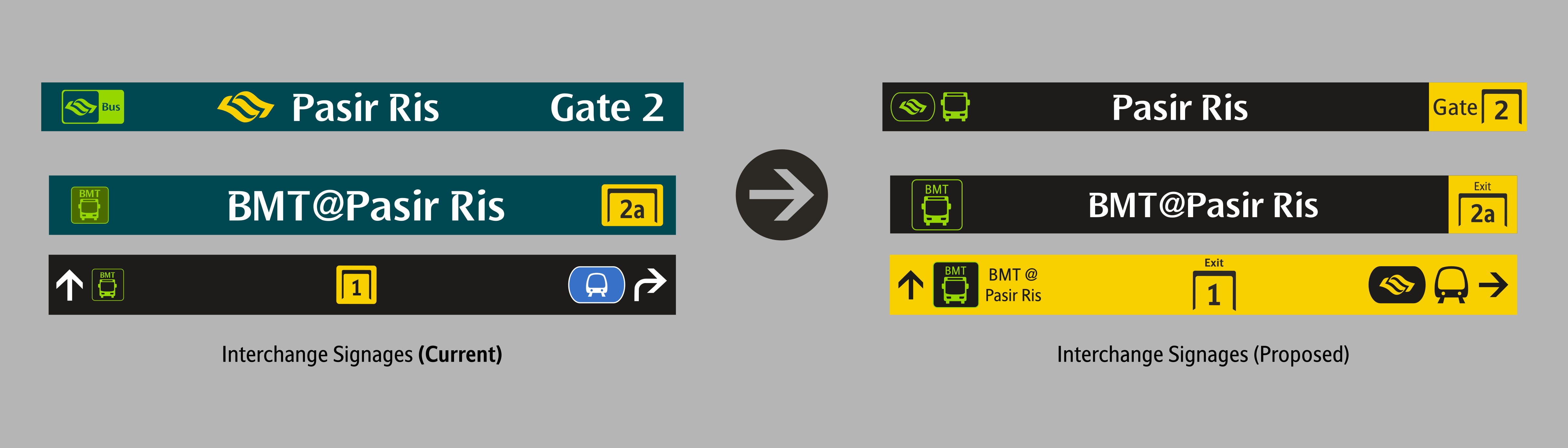
The MRT caplet on the current signage, (the one in blue) might confuse commuters. Usually, a blue coloured caplets meant that the MRT line it is bringing the commuters to, is the Downtown Line. To reduce confusion, I have decided to replace it with the MRT caplets (my redesigned version) shown on Station Entrances.