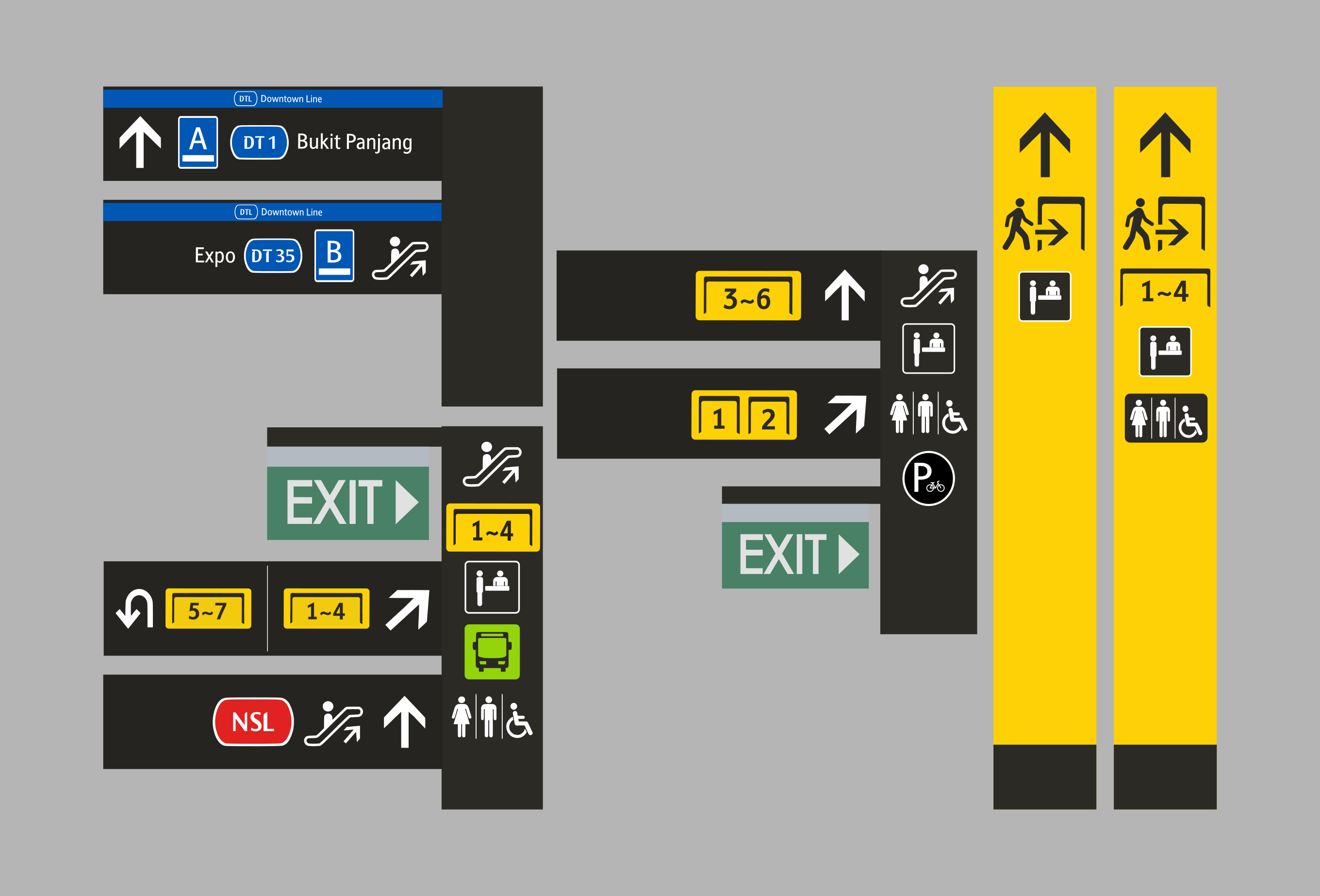
This section will showcase the existing icon assets currently in use, categorised into different sections.
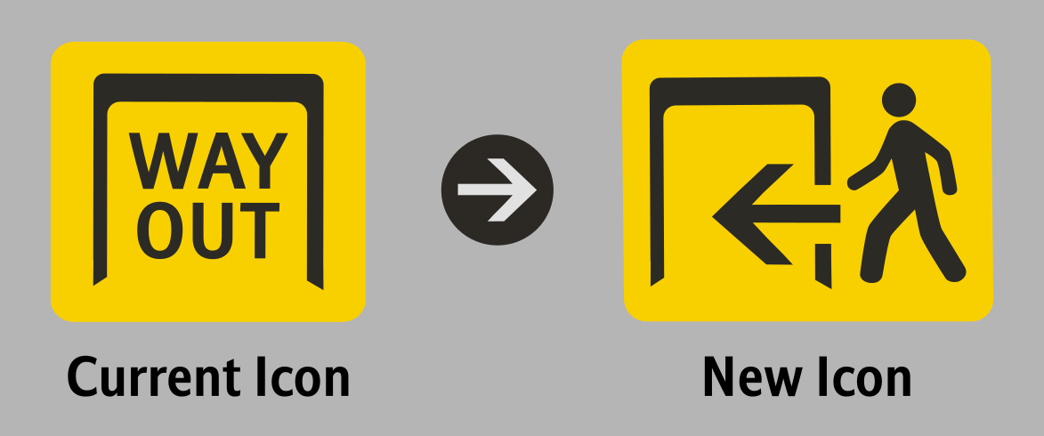
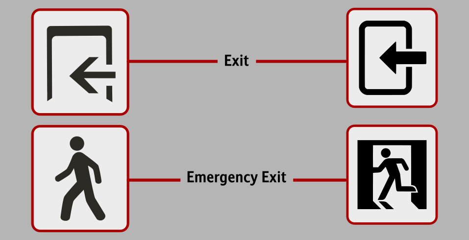
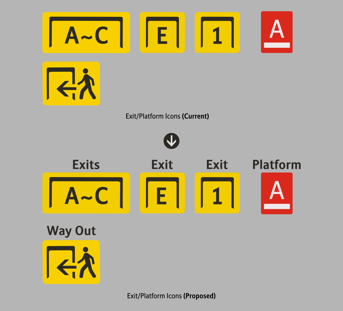
Way Out Icon
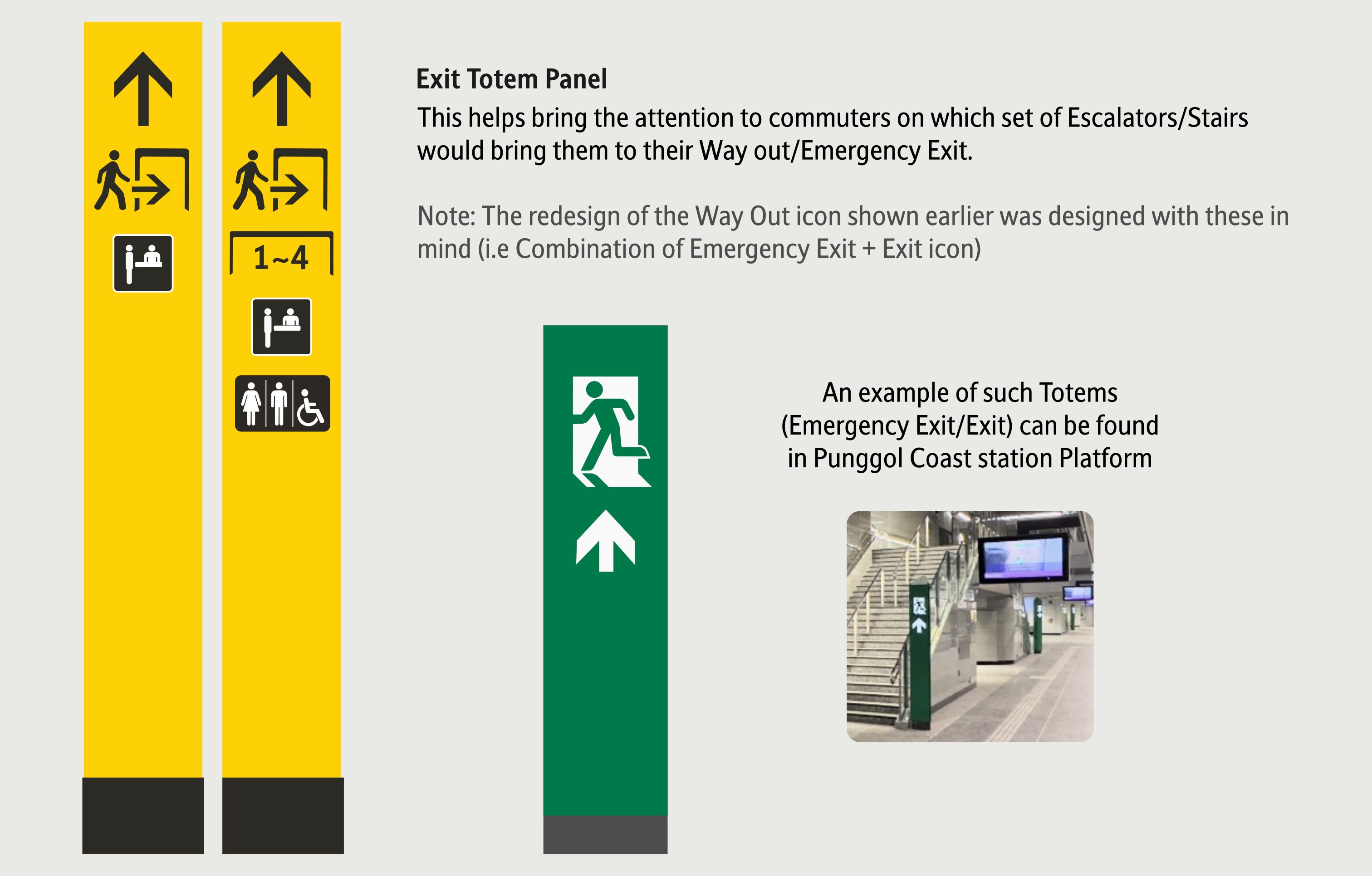
The proposed new Way Out icon combines two elements: the Emergency Exit Icon and the Exit Icon. Commuters will be able to distinguish the Exit icon more easily with the use of the Exit colour, as well as the 'Exit Border' symbol, which is currently being used to signify exits.
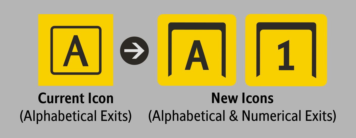
Exit Icon
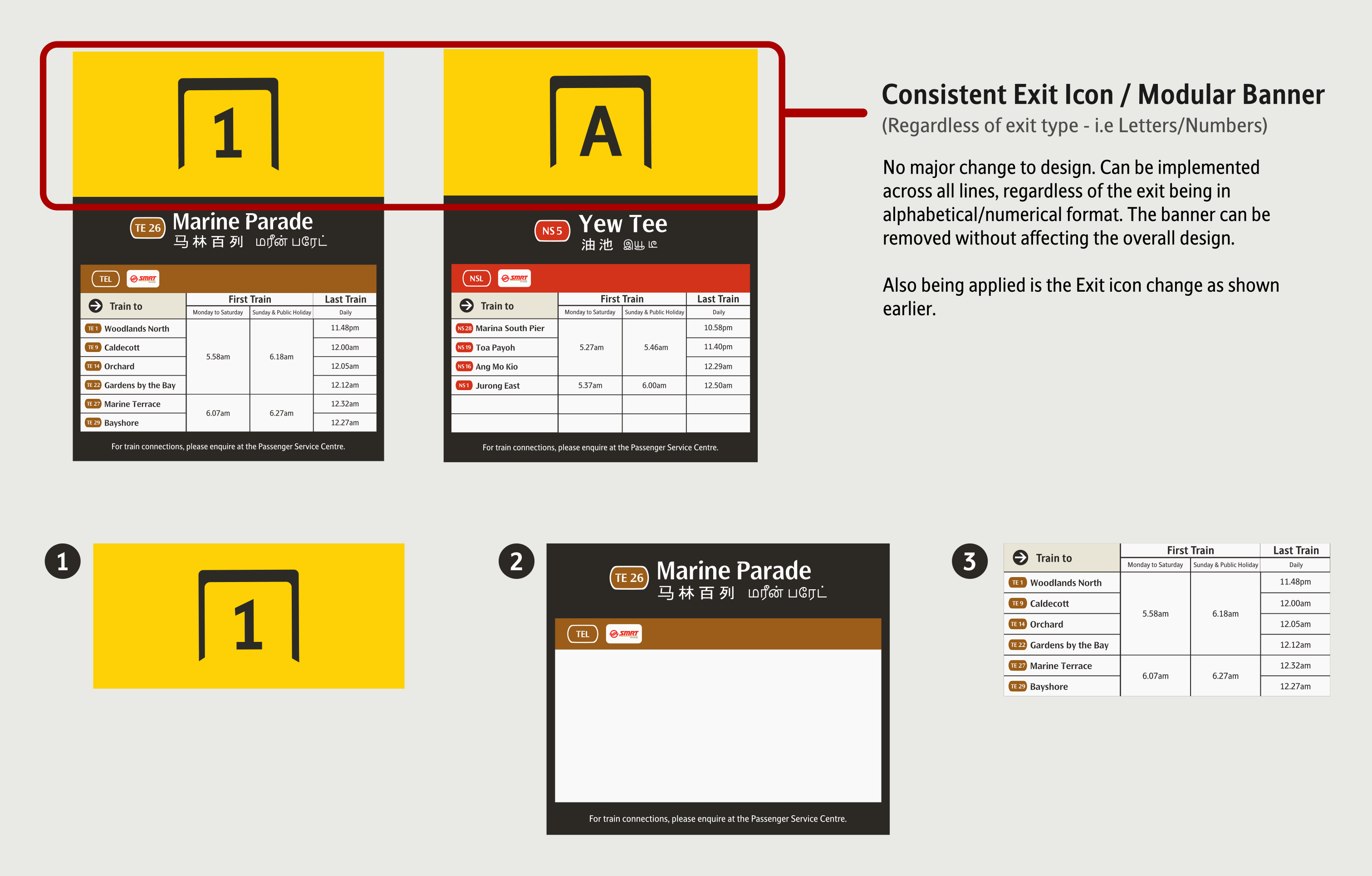
The proposed new Exit icon standardises the use of the 'Exit Border' symbol for those using both numbers or alphabets. Currently, the Exit icons for numbers and alphabets are labelled differently.
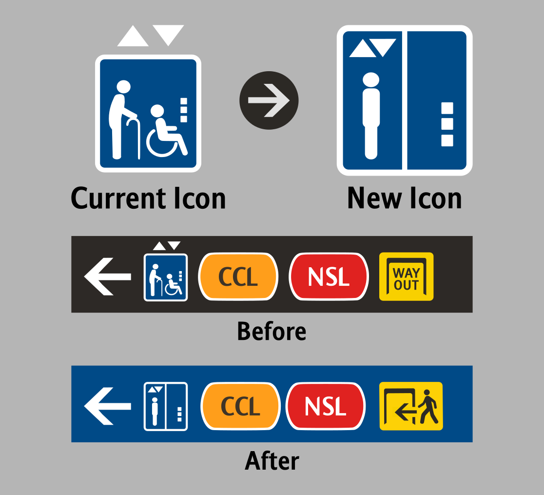
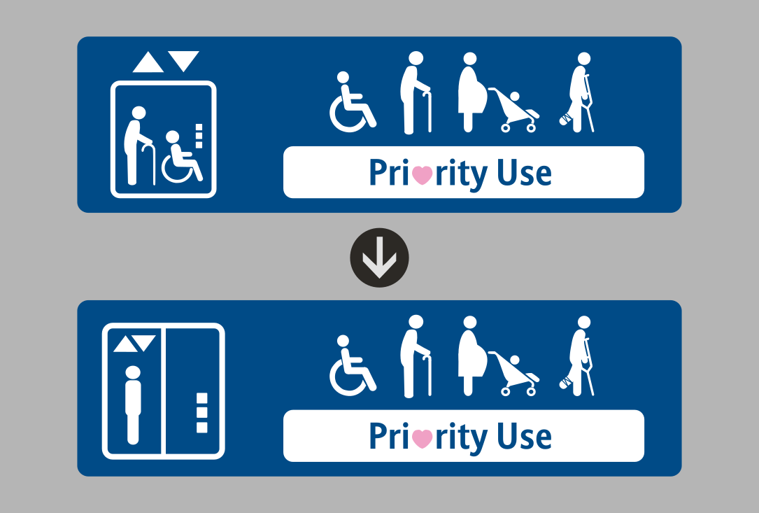
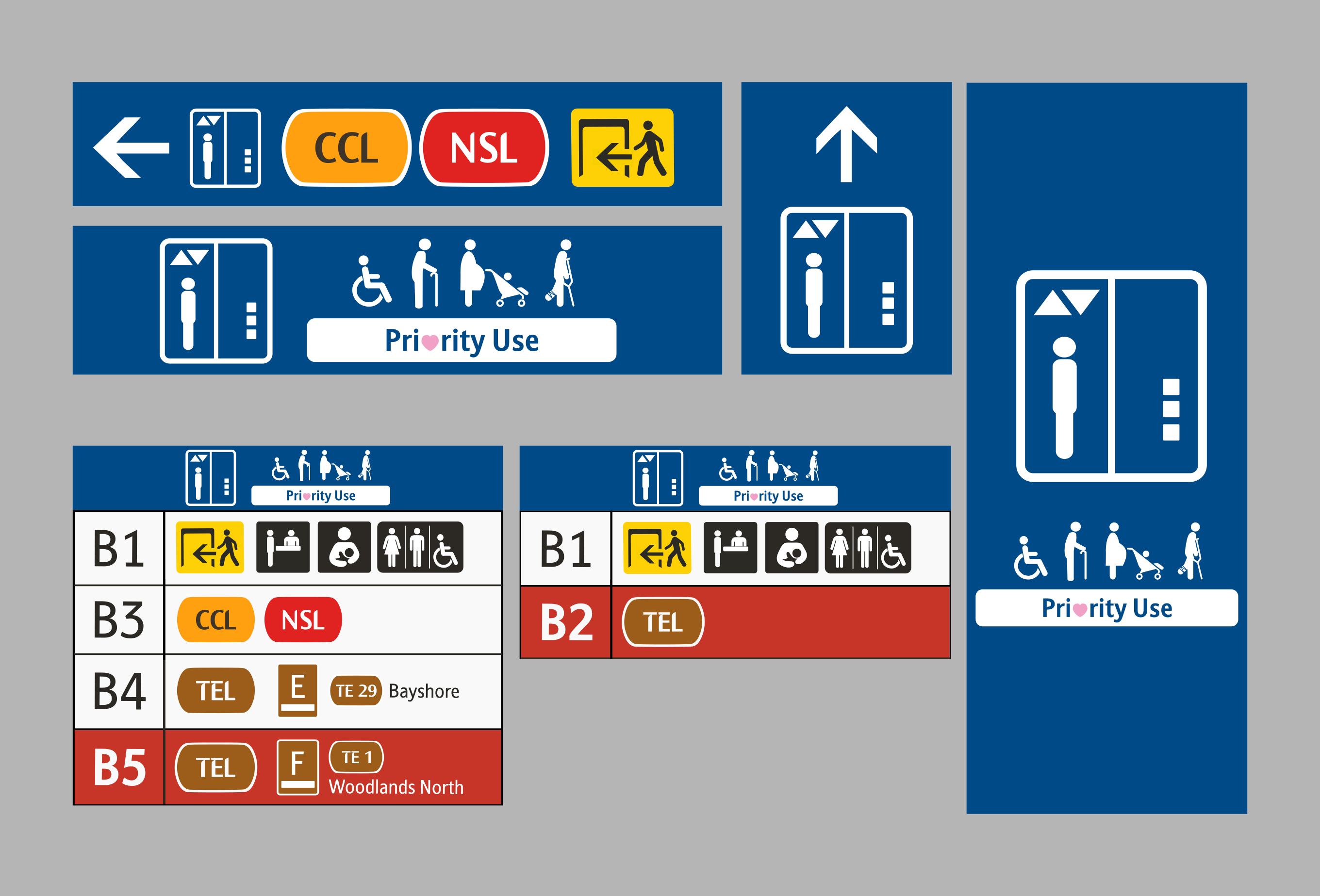
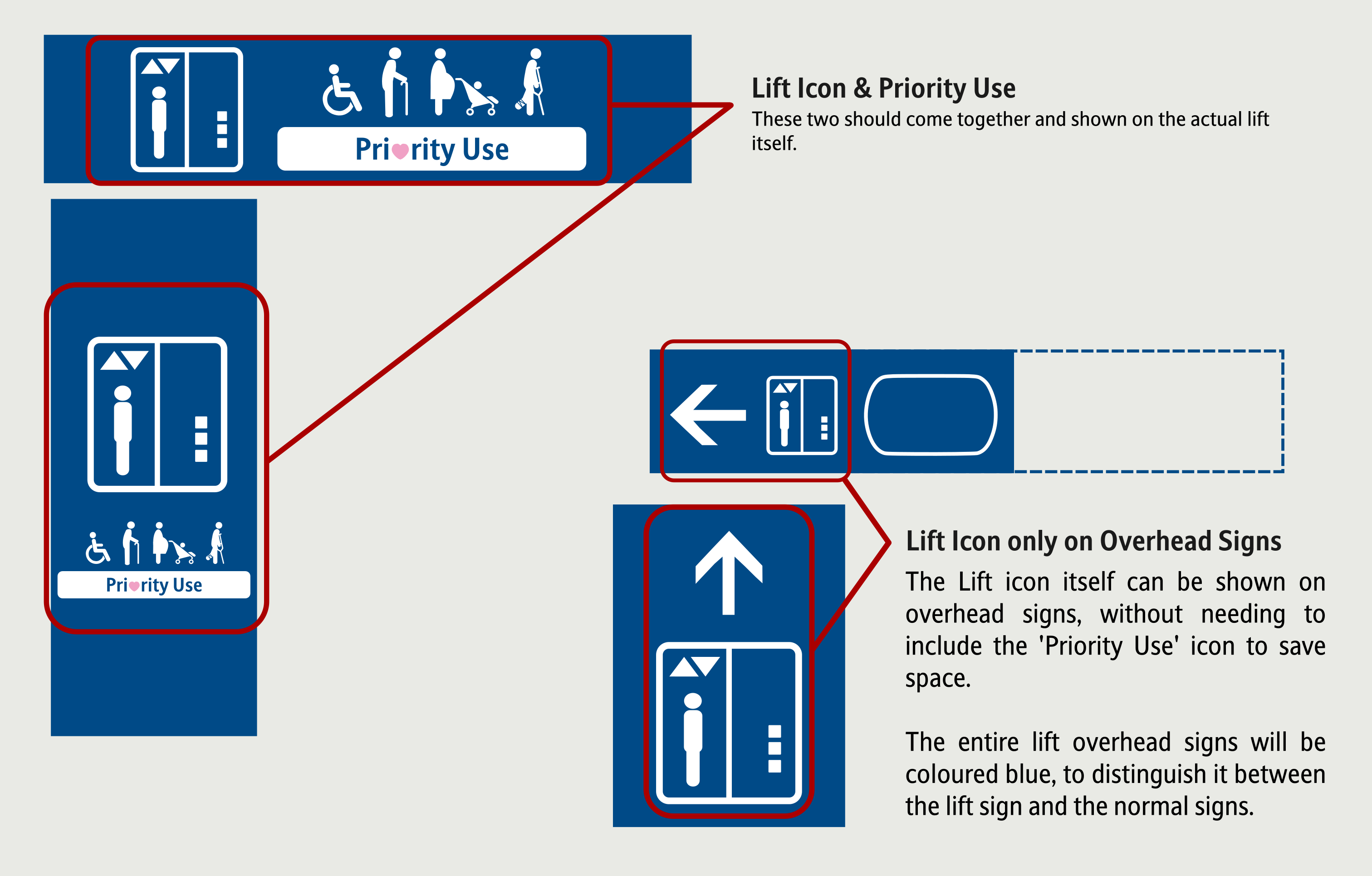
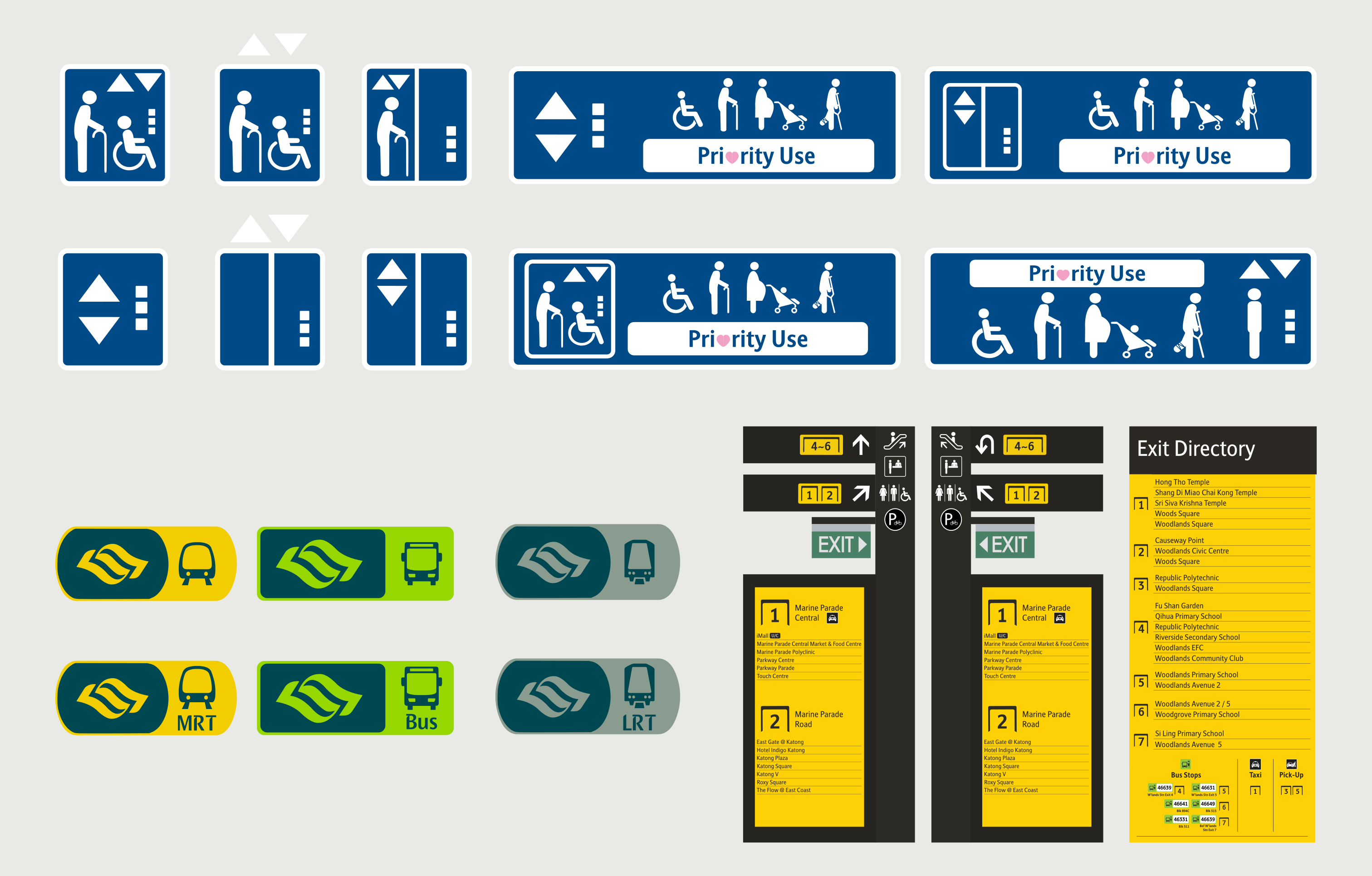
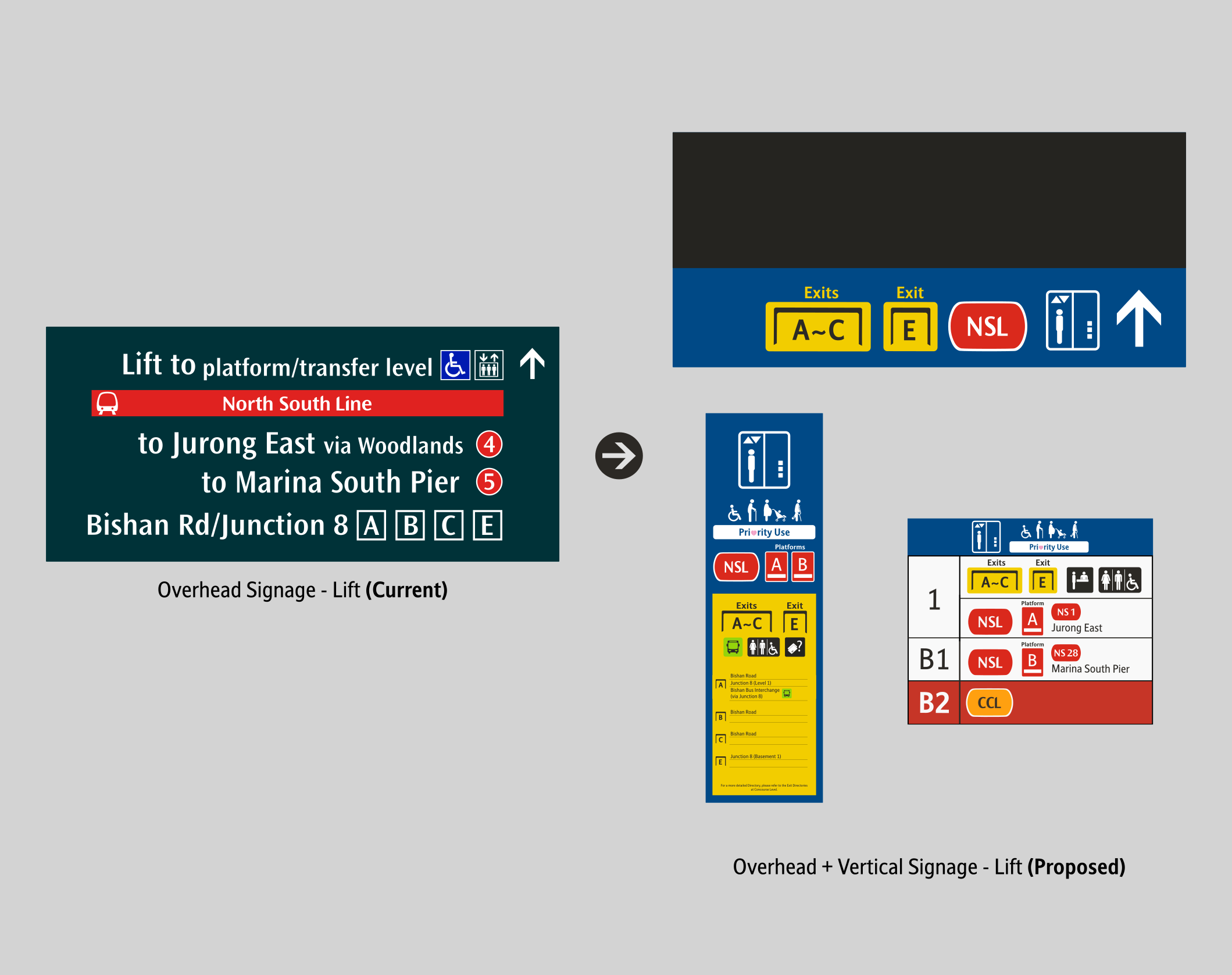
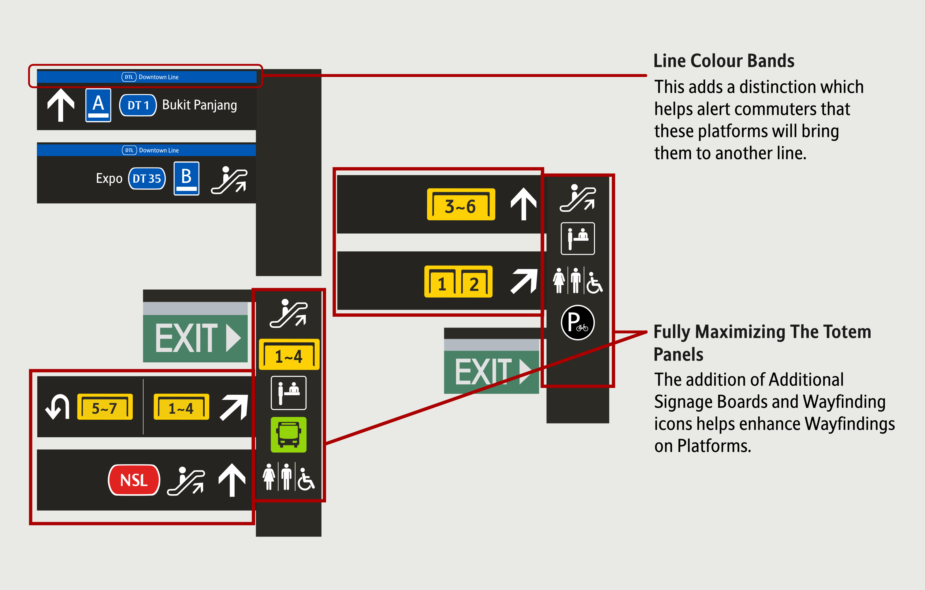
Lift Icon
The Lift Icon received a minor change. To
maximise
space, the Up and
Down arrows have been placed in the icon, and the inclusion of only one
person in the lift icon.
This is because the wheelchair symbol has been included together with the
'Priority Use' signage,
hence, it is redundant to include the wheelchair icon.
The use of Blue Signages to signify lifts has also been expanded. This is to
ensure that the lift
signs
are easily distinguishable from the rest of the signage variants.
(i.e
Blue Signages =
Lift)
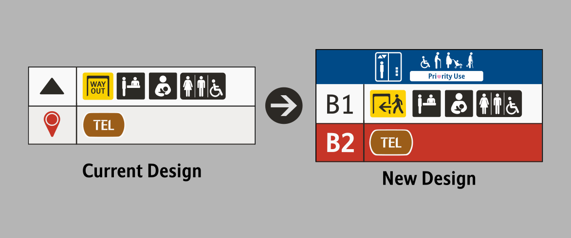
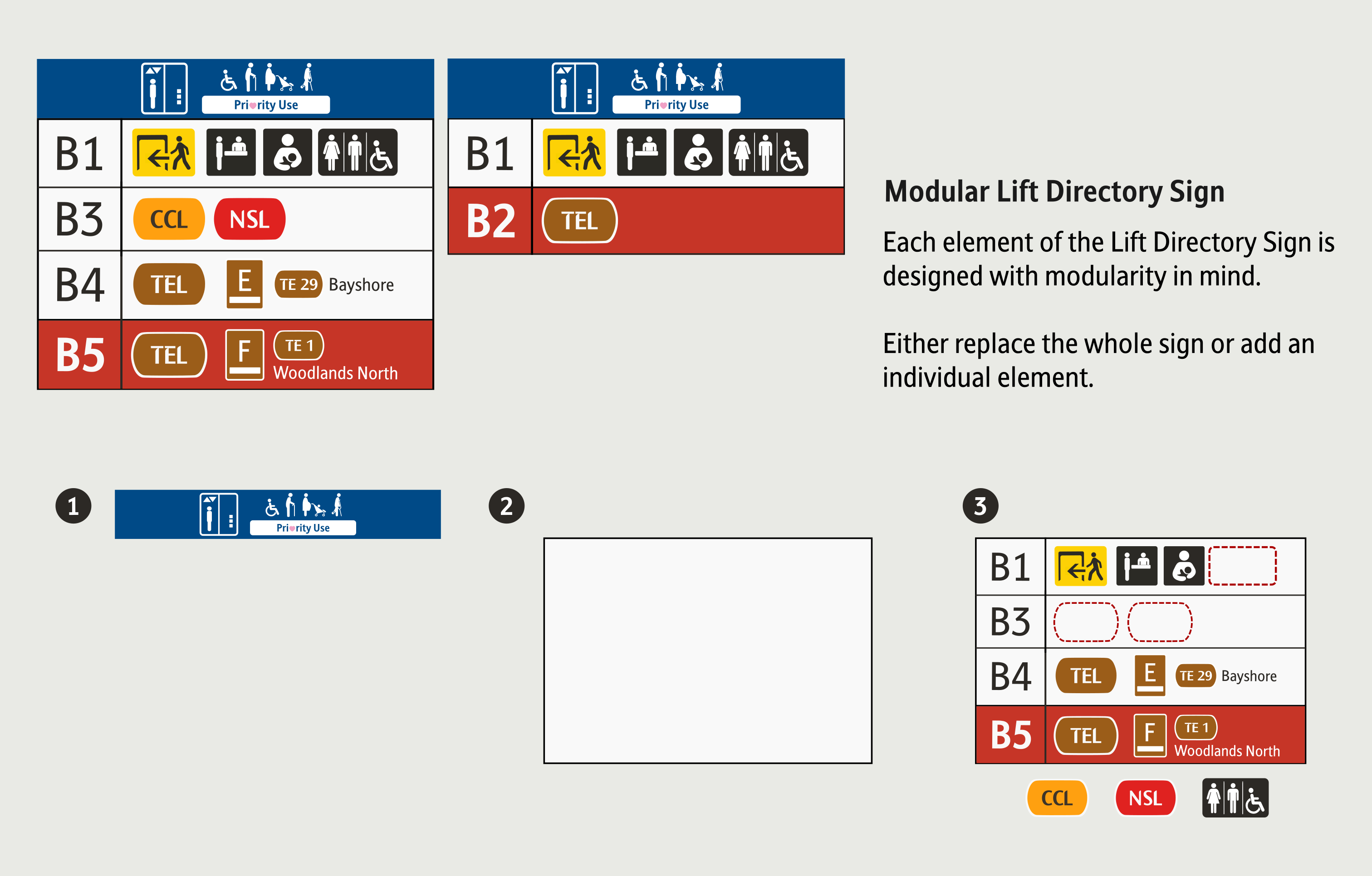
Lift Directory Sign
The Lift Directory sign has also received some
minor updates. The floor
number has been brought back, and the 'You Are Here' icon removed and
replaced with the colour
itself.
The Floor Rows in the sign is now clearly highlighted for better clarity and
helps commuters
identify the level they are at instantly.
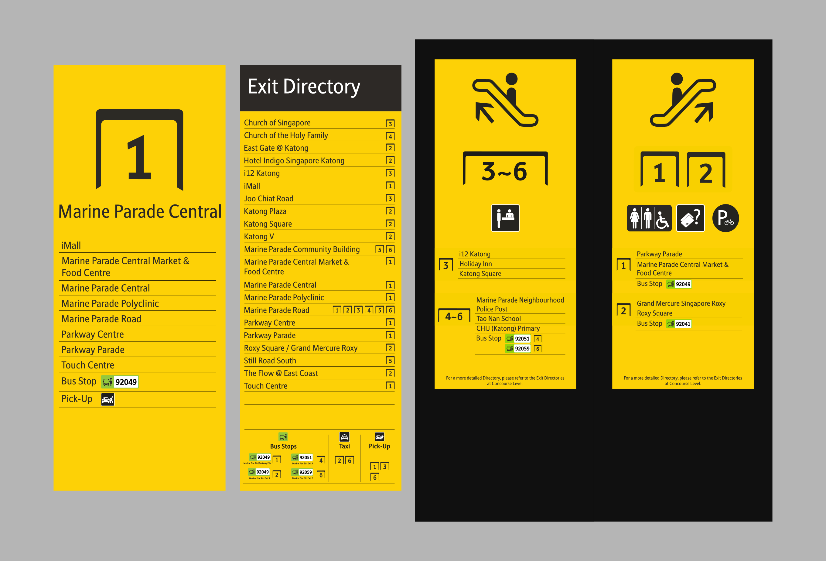
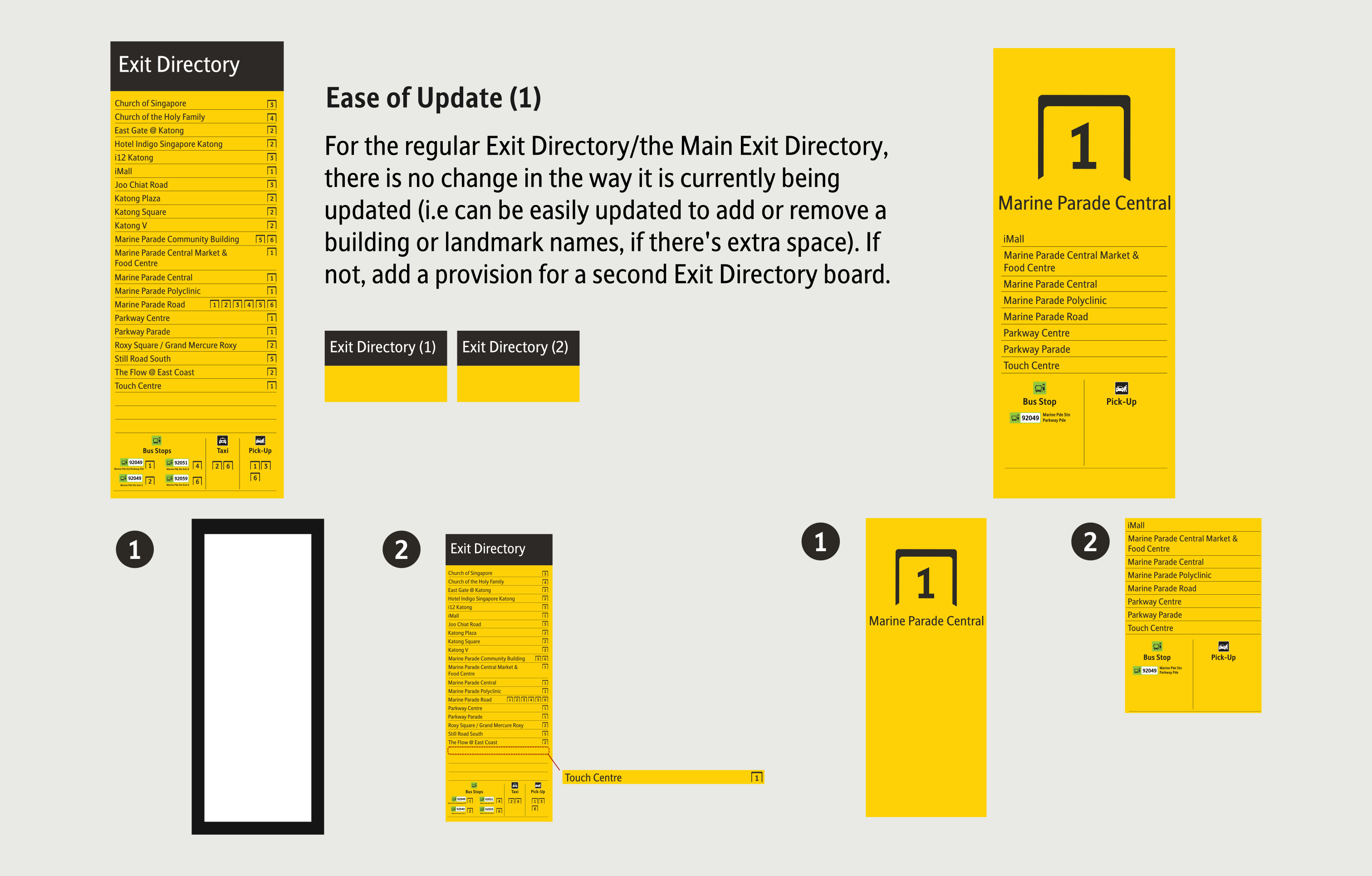
Exit Directory Sign
The Exit Directory received a minor change and
addition. Previously,
the initial proposal was to arrange it by Exits, but that proved to be
infeasible because
constant
adding or removing of buildings or landmarks will make the process difficult
and inefficient.
The
only enhancement is the inclusion of Bus Stop Name alongside its existing
Bus Stop Codes..
The Exit banner have been enhanced as well. Instead of an empty space, the
Exit Directories on
Exits have been re-instated. This was done before, but removed in the
current system.
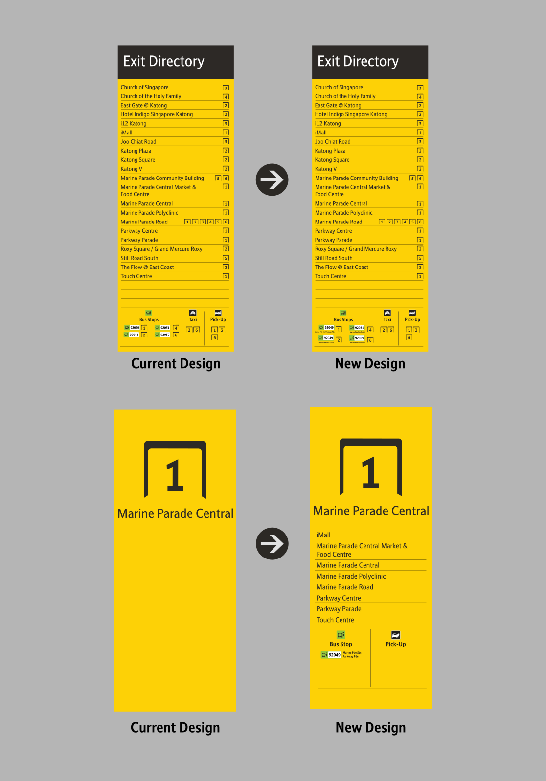

"Exit-Specific" Exit
Directory
📸:
ourhound.com
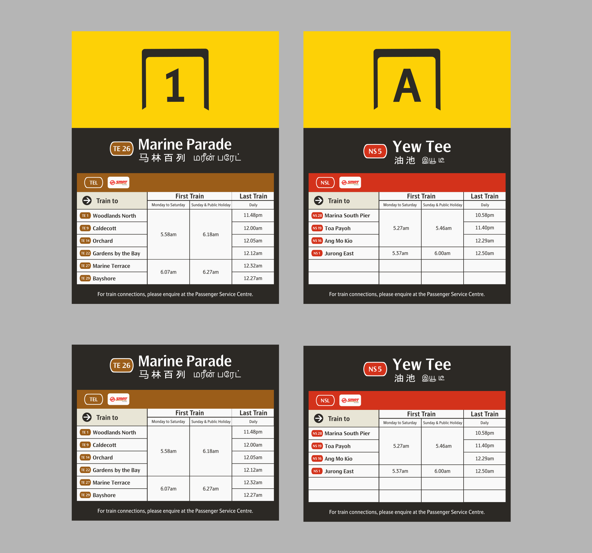
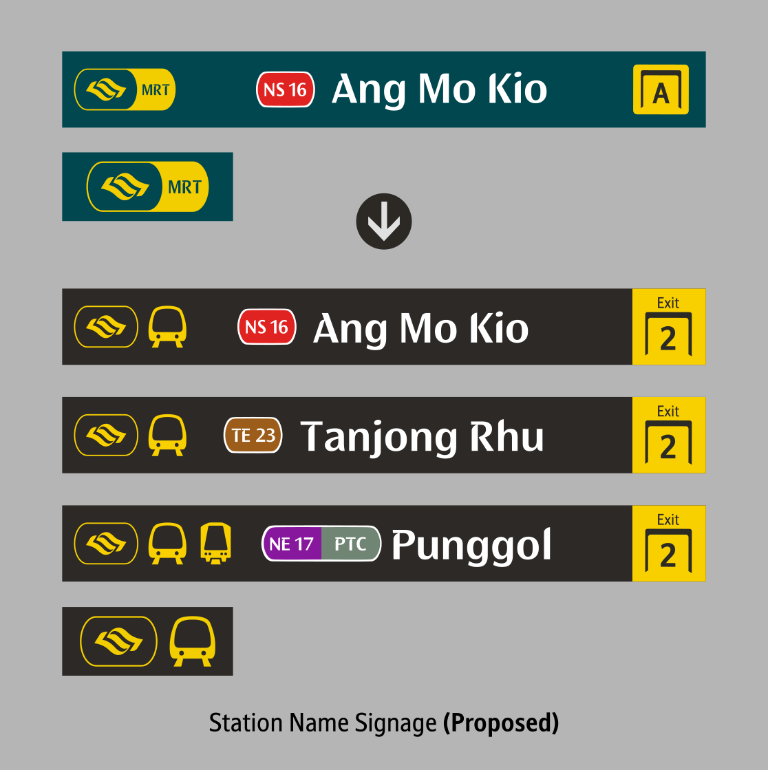
Station Name Sign
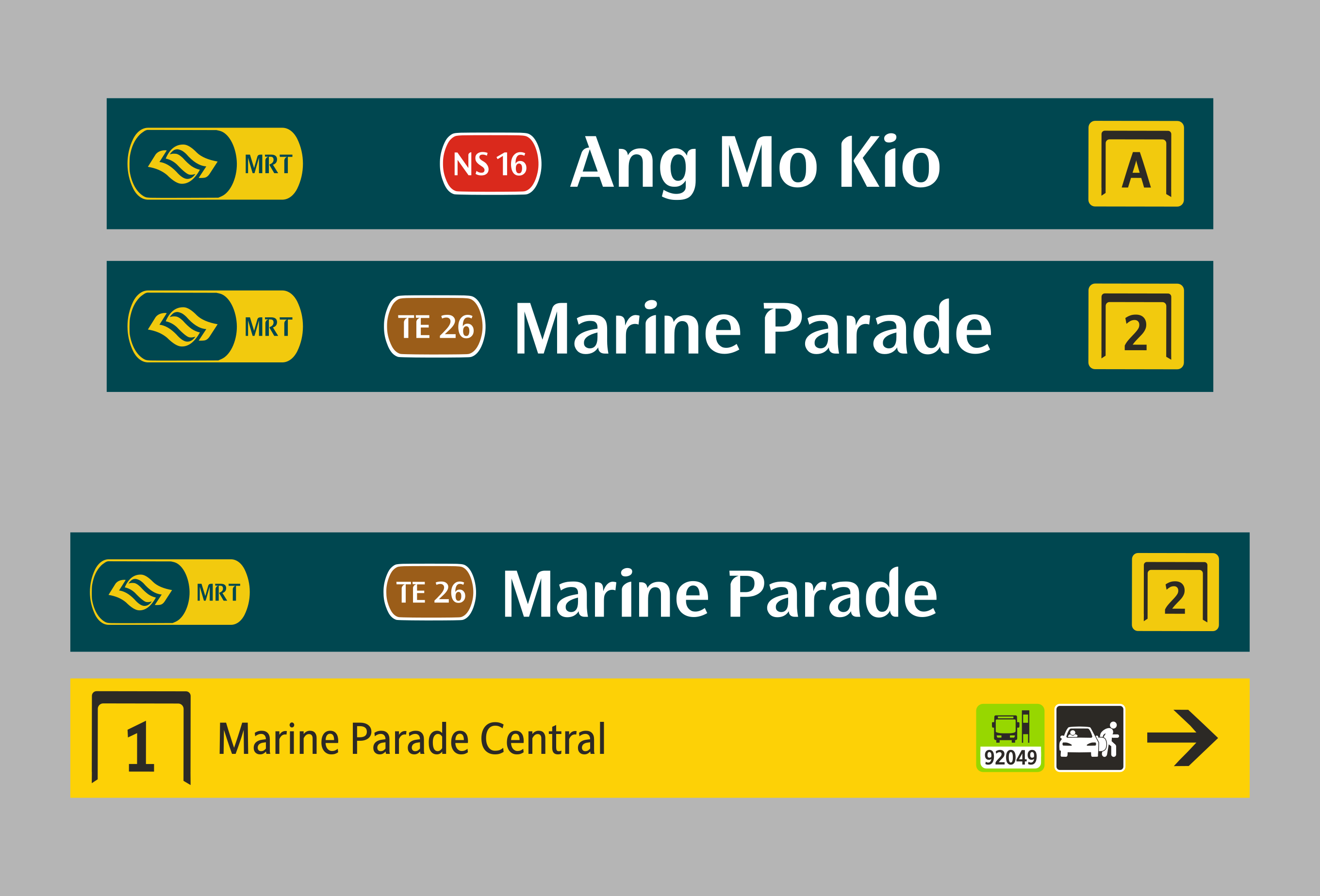
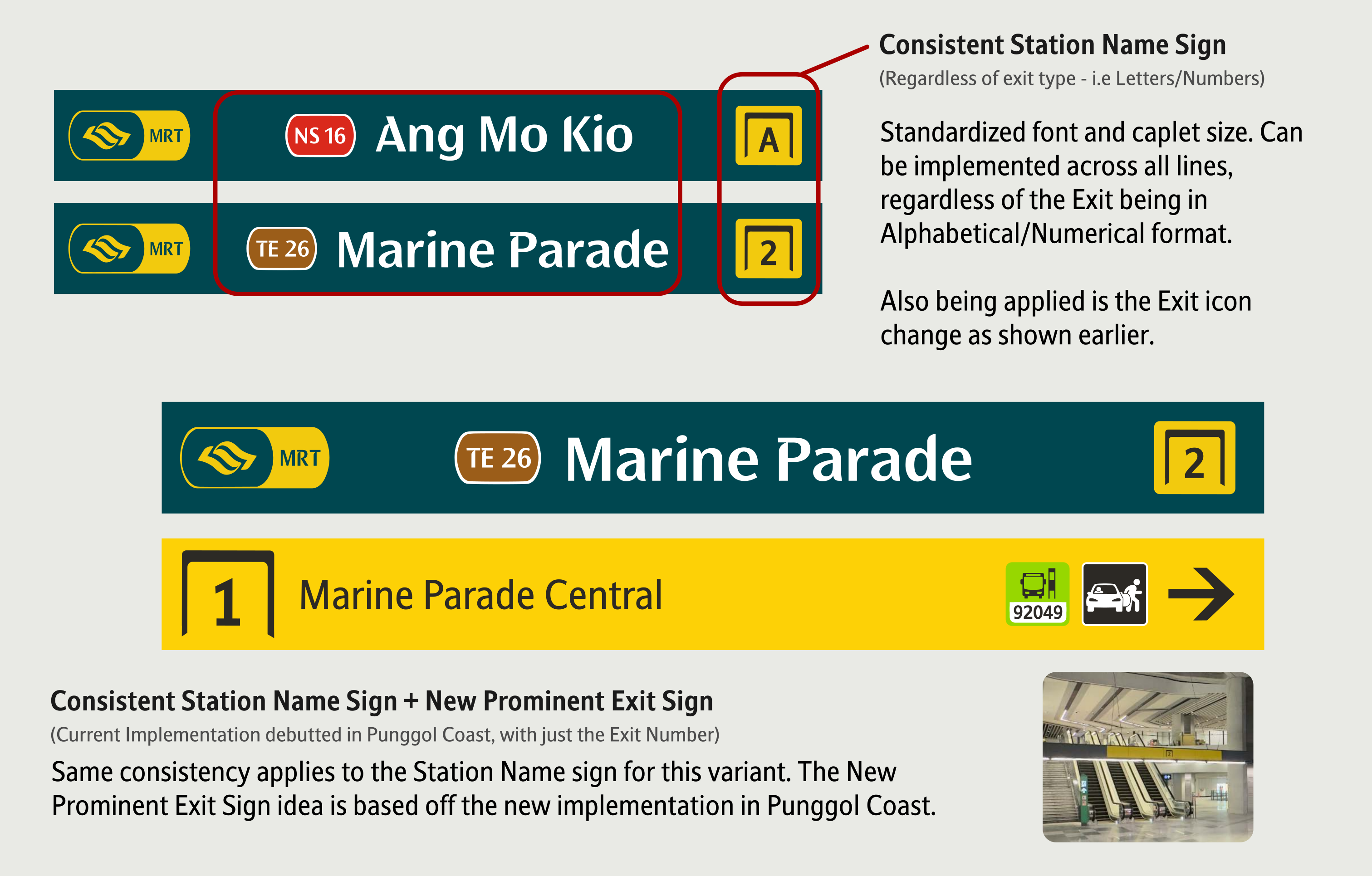
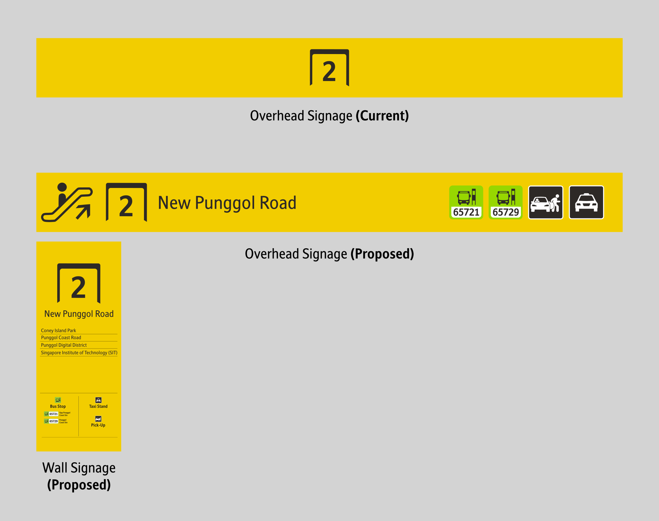
Currently, there are two variants to the Station Name signs. Those earlier versions have a smaller station name, while the latest ones are enlarged. The current enlarged texts are found on most TEL4 stations and stations like Ang Mo Kio, signifying that this will be the standard moving forward. However, the current enlarged ones seemed quite awkward looking, and the new design aims to fix these issues, although minor.
Station Exit Sign
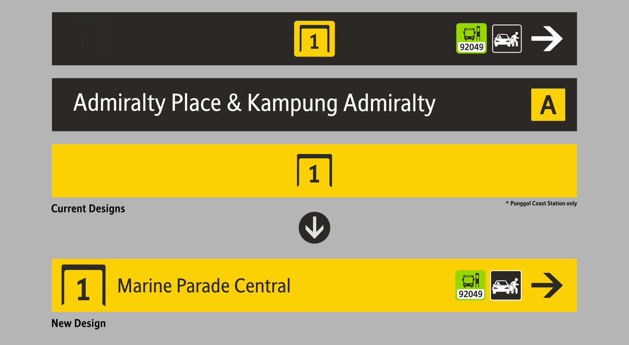
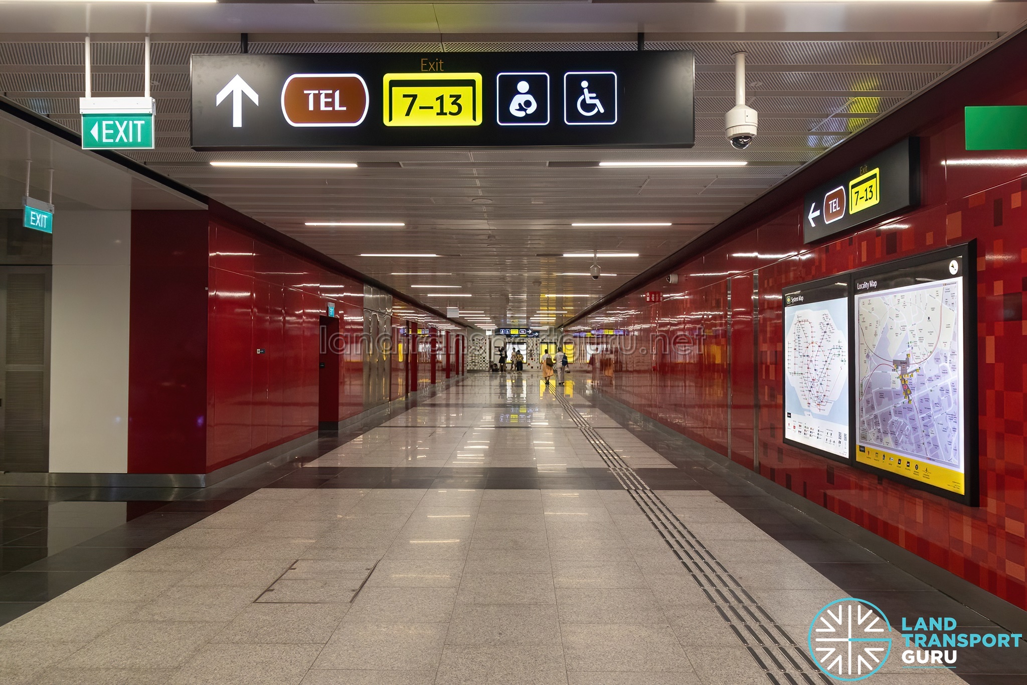
Currently, there are three variants to the Station Exit signs. The current version has the Exit Number and icons with a grey base, another, with the Exit Name and Exit Letter Icon. The latest ones, only available at Punggol Coast, have a coloured Exit sign with only the Exit Number present. The new design combines all three elements, alongside the addition of street names on the Exit sign.
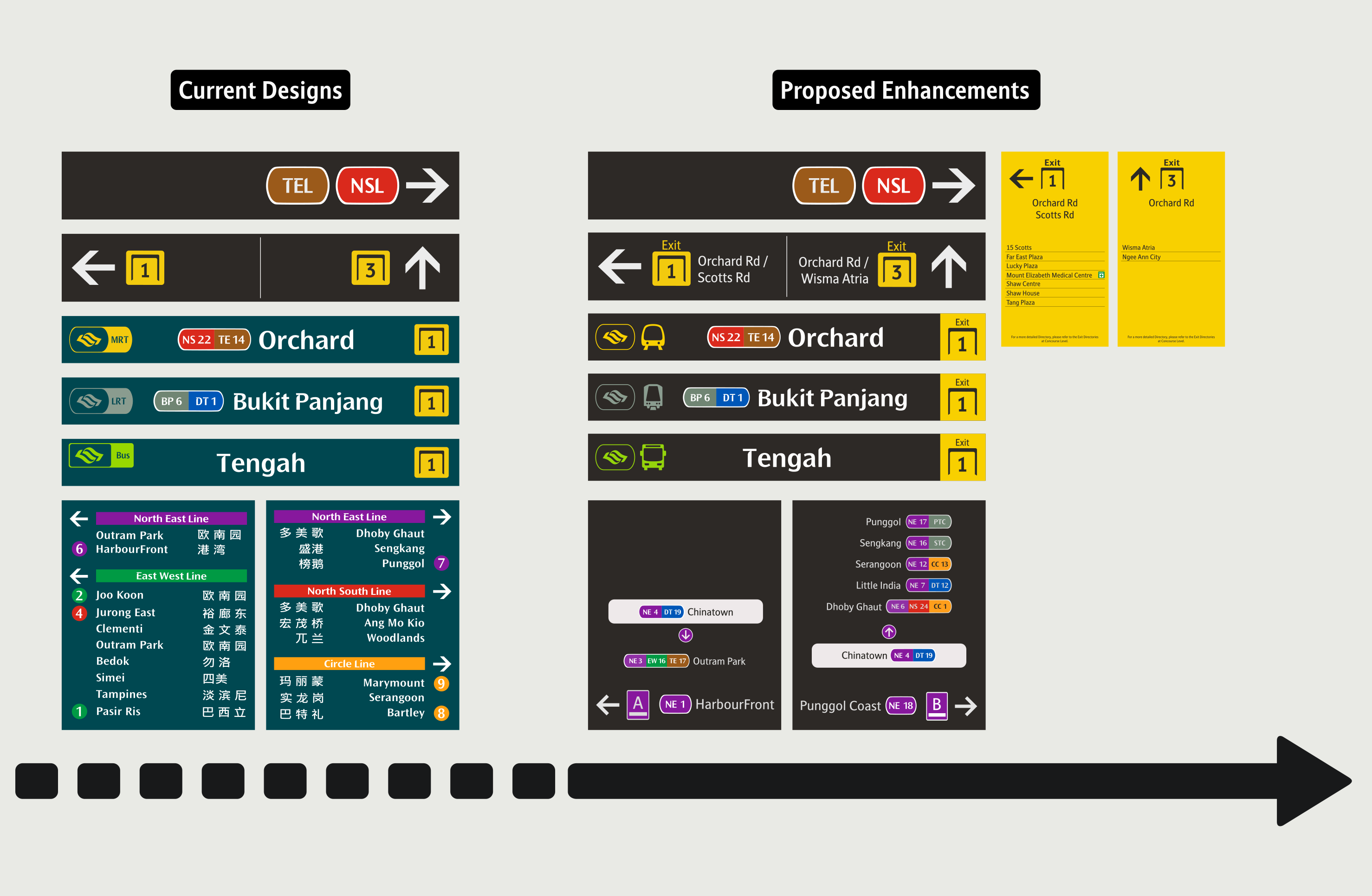
This section will showcase the different changes proposed being applied, and how those signage elements can be maintained.
Tapping on existing designs, along with the proposed changes, I further tweaked the design based on my own feedbacks gathered on the ground, and came up with new ideas that I believe will enhance the overall user experience.
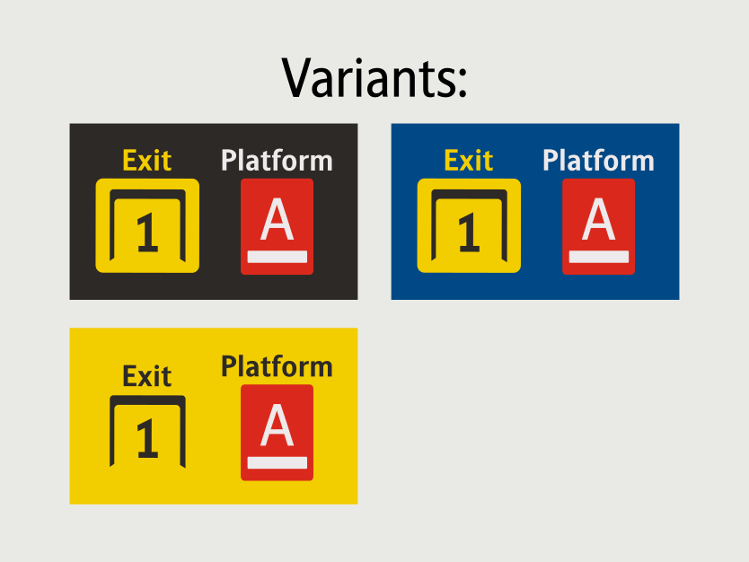
Labels
From feedbacks on the ground, many commuters didn't understand what "A with a Dash below" the "Gate" meant. Those descriptions actually refers to the Platforms and Exits respectively. To make it clearer, an 'Exit'/'Platform' label has been added, and it is now mandatory to be added. Current implementations saw the labels at the top for Exits as temporary (stickered on at a later part, and not integrated into the design.)
Iconography
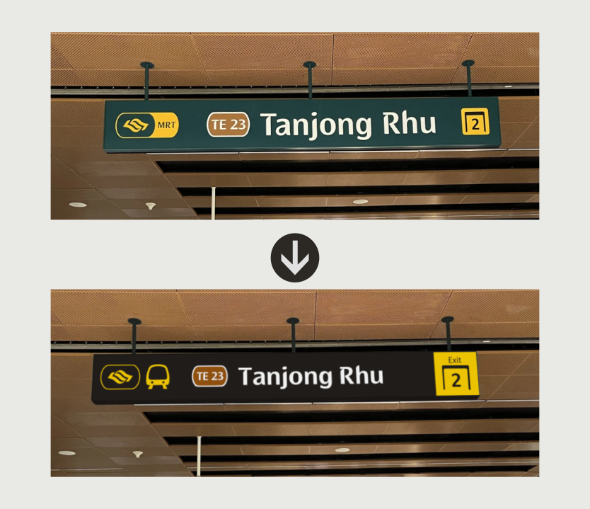
It's time to let the Dark Green Background retire. Previously used on backgrounds of Station Name signages, it progressively got replaced with a darker shade of Grey. The current implementation uses a combination of both Dark Green and Dark Grey, hence I have decided to only stick with just the Dark Grey colour across all signages.
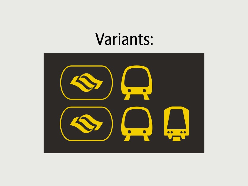
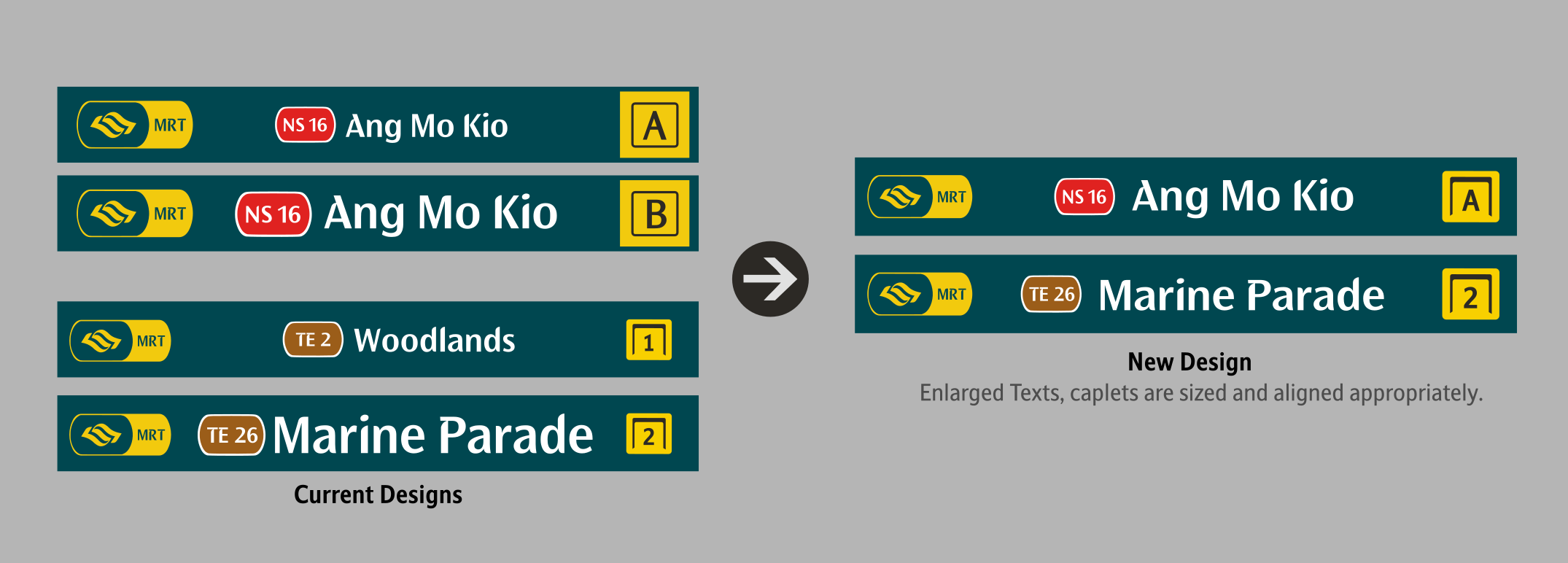
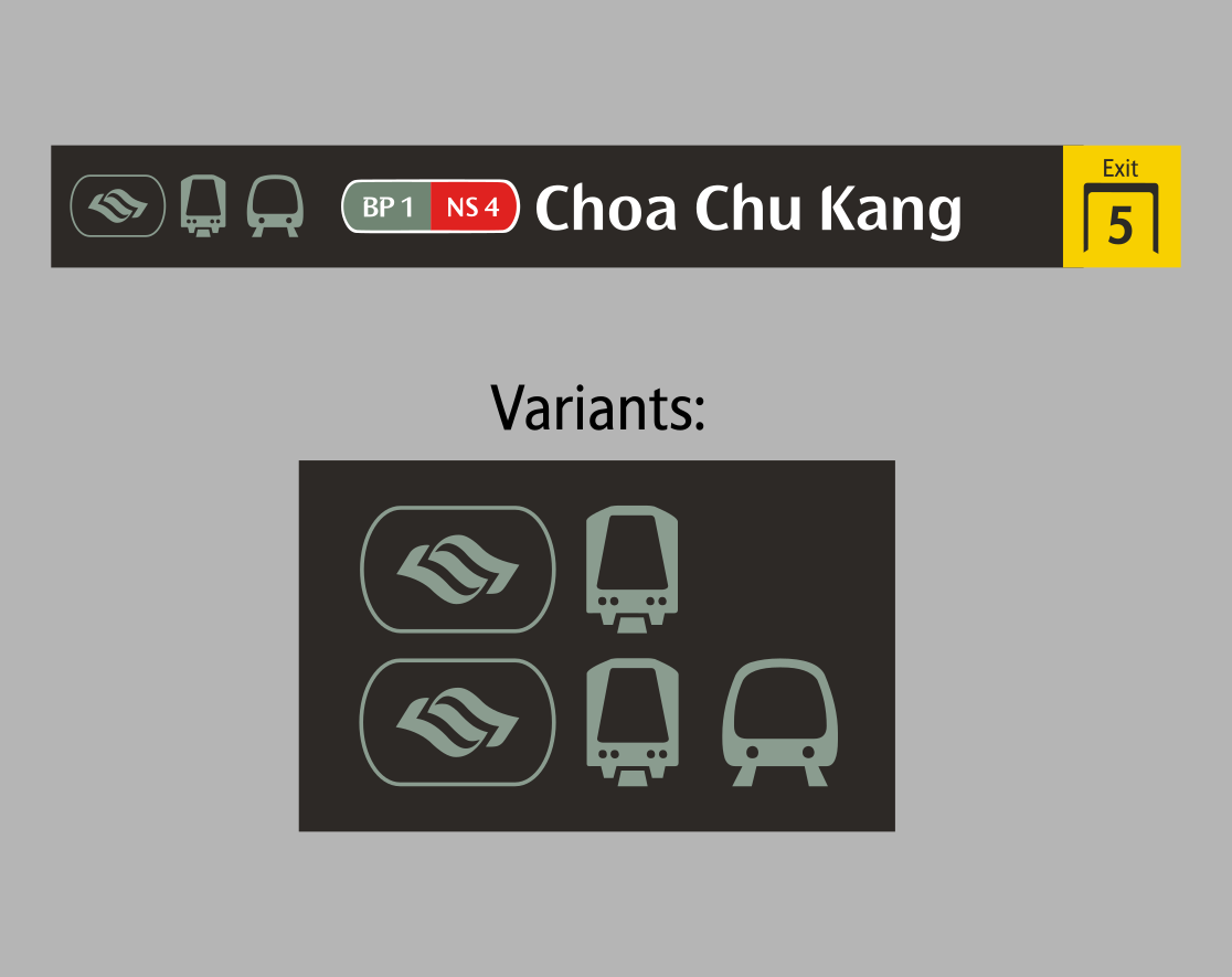
For the MRT/LRT icons, the main MRT/LRT line that exit serves, takes precedence (e.g If Exit 5 serves the Bukit Panjang LRT, the caplets will reflect the LRT's colour)
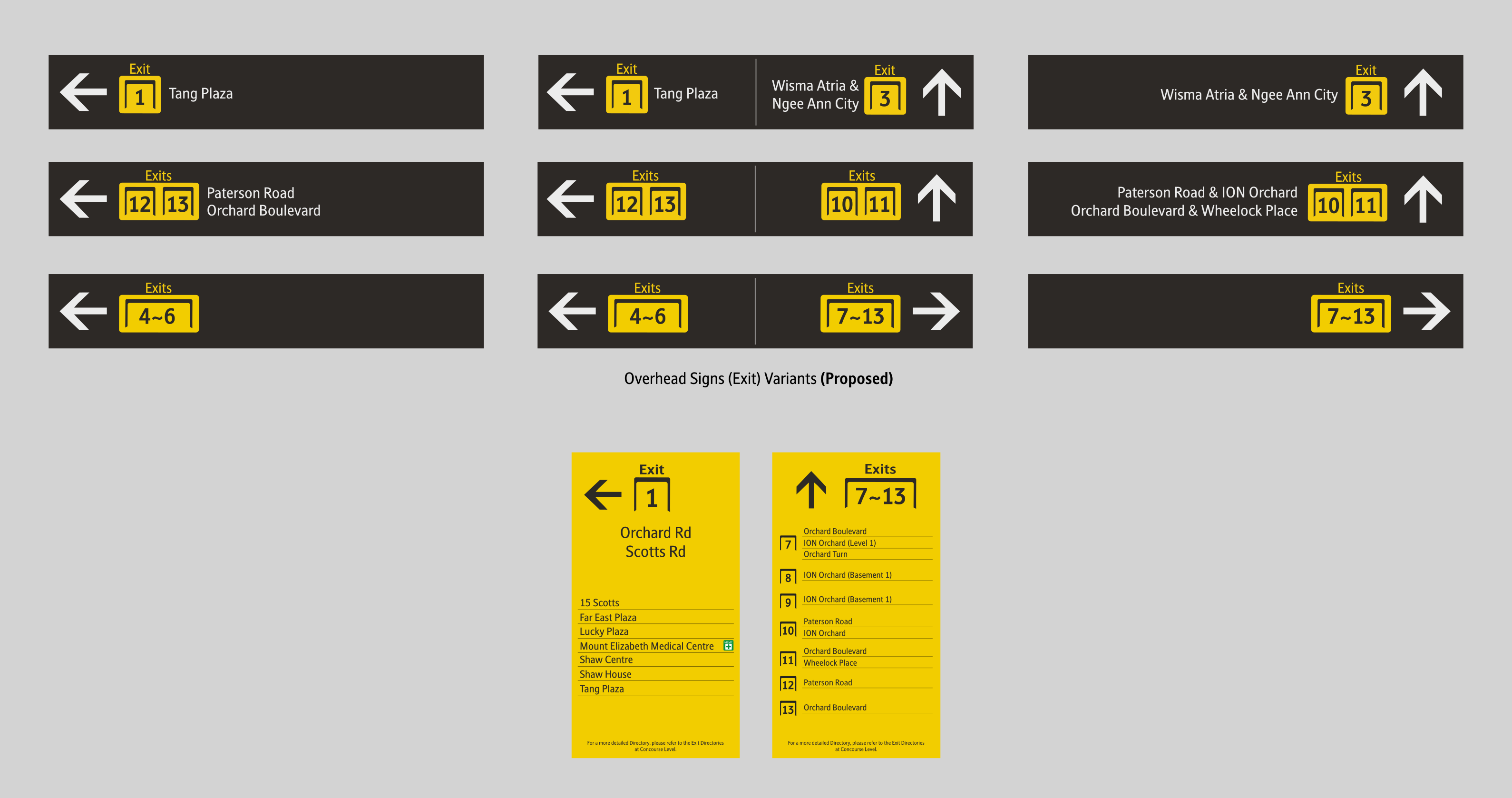
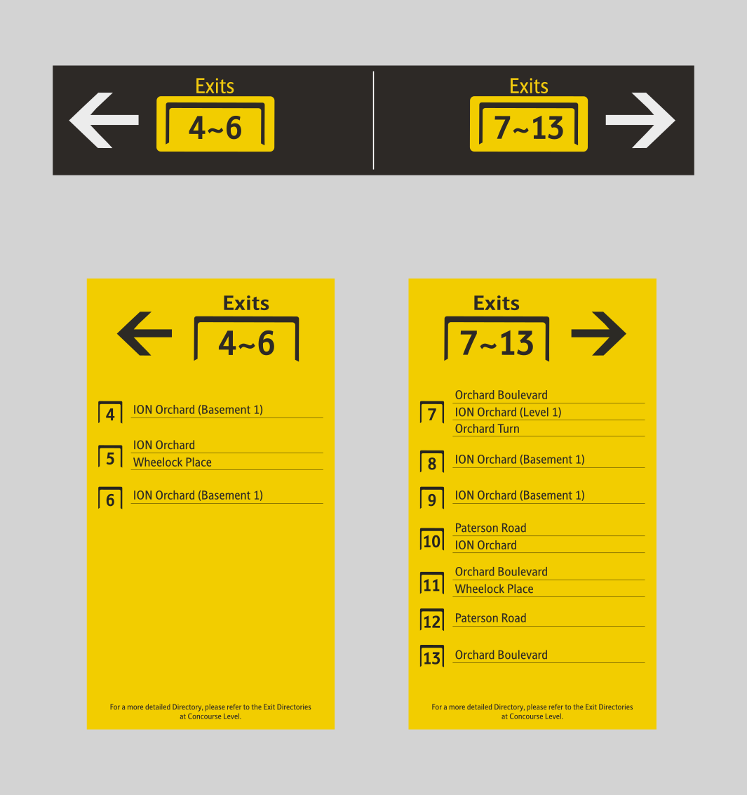
Station Names on Exit
The Street Names on the Overhead signages were
removed in
the New Wayfinding System. While it is understood that the
removal of the Street Names was to make the signages more
simplified, I believe there is a better way to still fit them in the
new system.
The Street Names will appear when there are only 1 or 2 exits
ahead. For multiple exits, the same principle currently being
implemented will apply here. To make up for the loss of
information, a separate wall Vertical Wall Signage will be
pasted instead.
Now, how do we implement these changes? Here are some of my ideas. Ideas include modernizing old signages, as well as improving on existing ones.
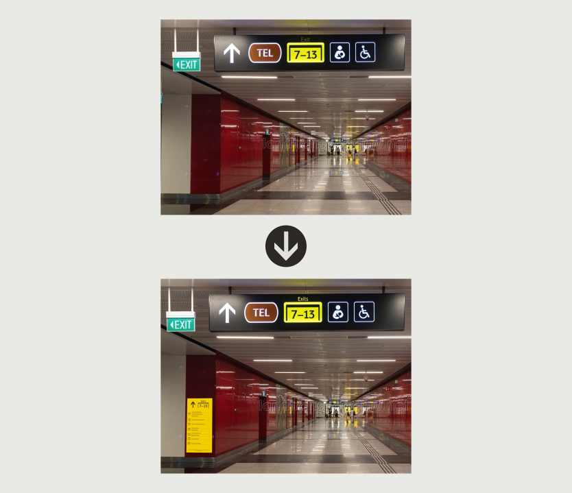
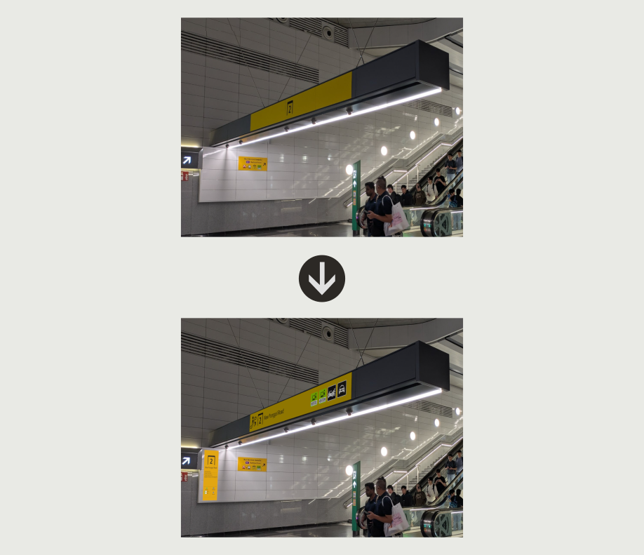
Exit Prominence
The implementation of the Main Exit Sign in Punggol Coast gives us a glimpse of how they would label exits. Yes, it's just putting the Exit Numbers there and calling it a day. The rest are all empty spaces. Hence I proposed adding on more icons on the signage - just the icons. If Commuters need more details, they can refer to the Signage on the Wall.
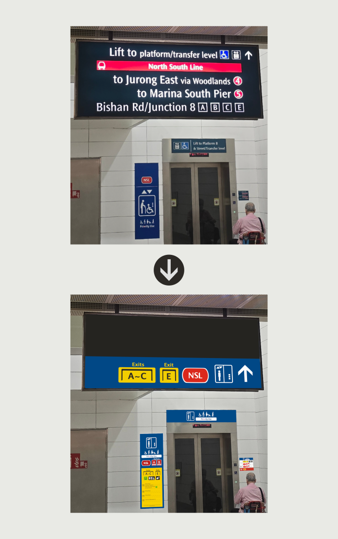
Modernizing Old Signages (1)
With LTA's vision of simplifying overhead
signs they removed useful information like
Street Names. Same concept as previously
mentioned, to compensate for the loss of
major information, on the overhead signage,
a separate wall Vertical Wall Signage will be
pasted instead.
For Platform Directions, I utilized the Floor
Indicator Signage, while the Street Name
information has been integrated in the
summarized Exit Directory as shown earlier,
into the lift signage.
My end goal for doing so is to offload the
information from the Overhead Signage to ta
more strategic place, such as the empty wall
spaces.
Modernizing Old Signages (2)
Some signages got stuck in time. It is
either
those signages have been forgotten, or it is
simply not feasible to constantly update,
hence it was lat updated when Circle Line
Stage 2 commenced service. It has not
gotten an update ever since.
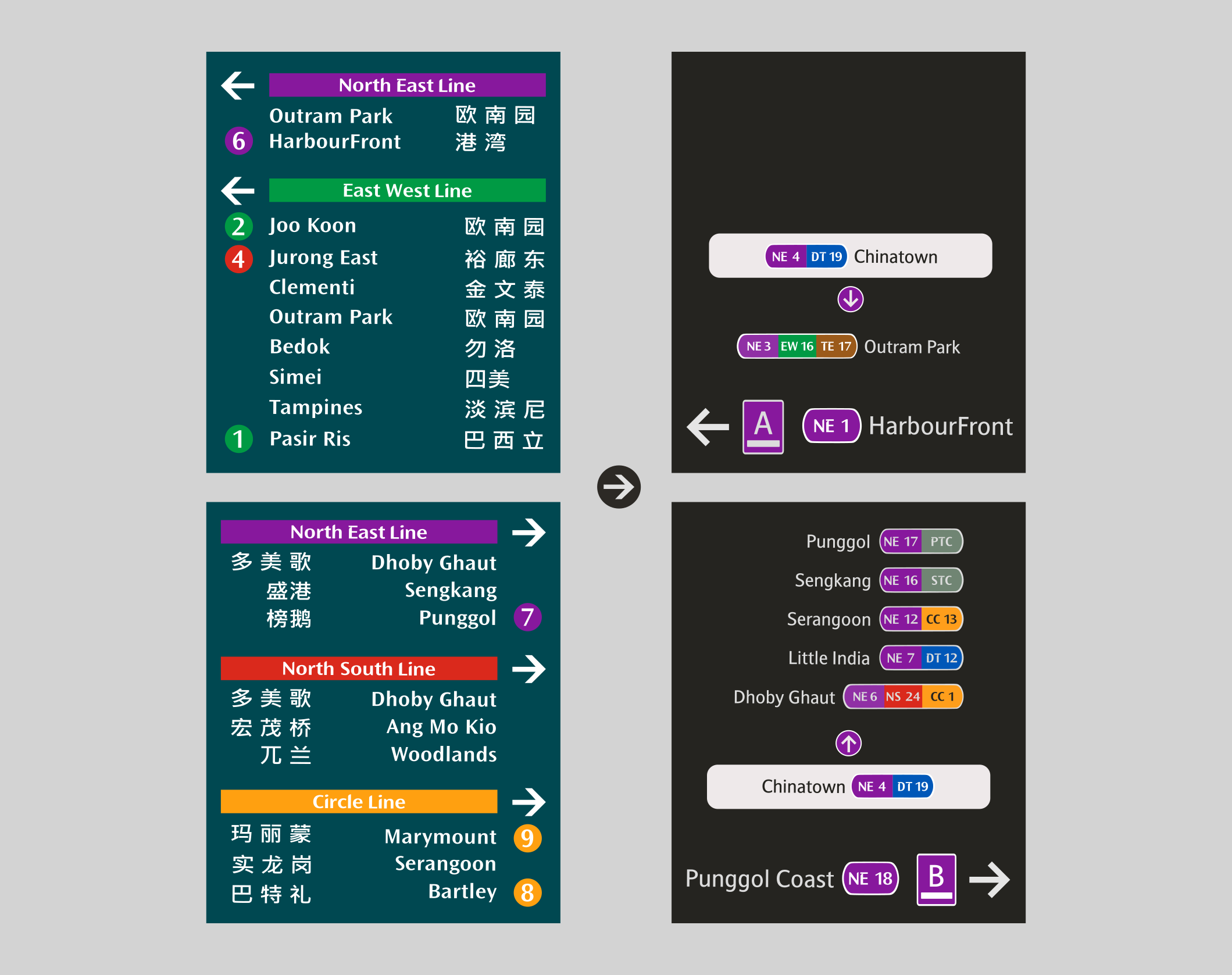
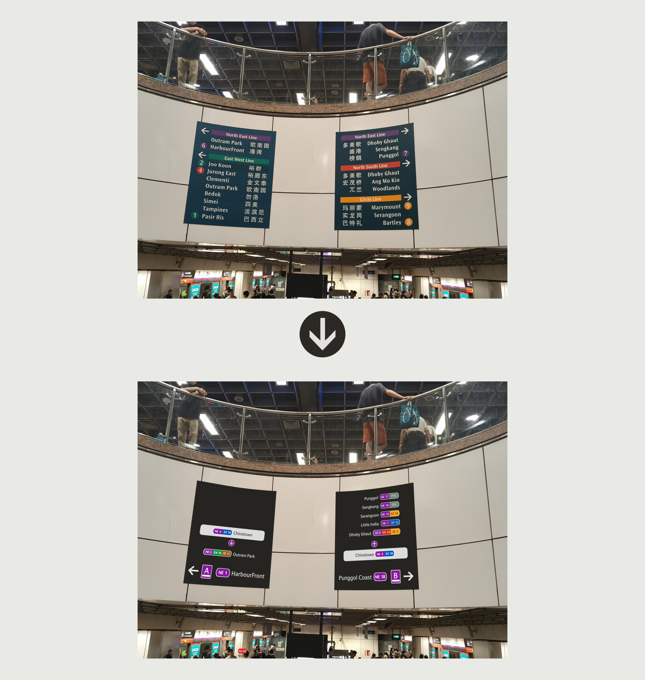
I considered giving the signages a fresh
redesign, while adding on the newer lines
but I felt that it could get too cluttered.
Hence, I've decided to list down the North
East Line's Key Interchanges instead. It will
be easier to update in the long run.